What comes to mind when you think of blue?
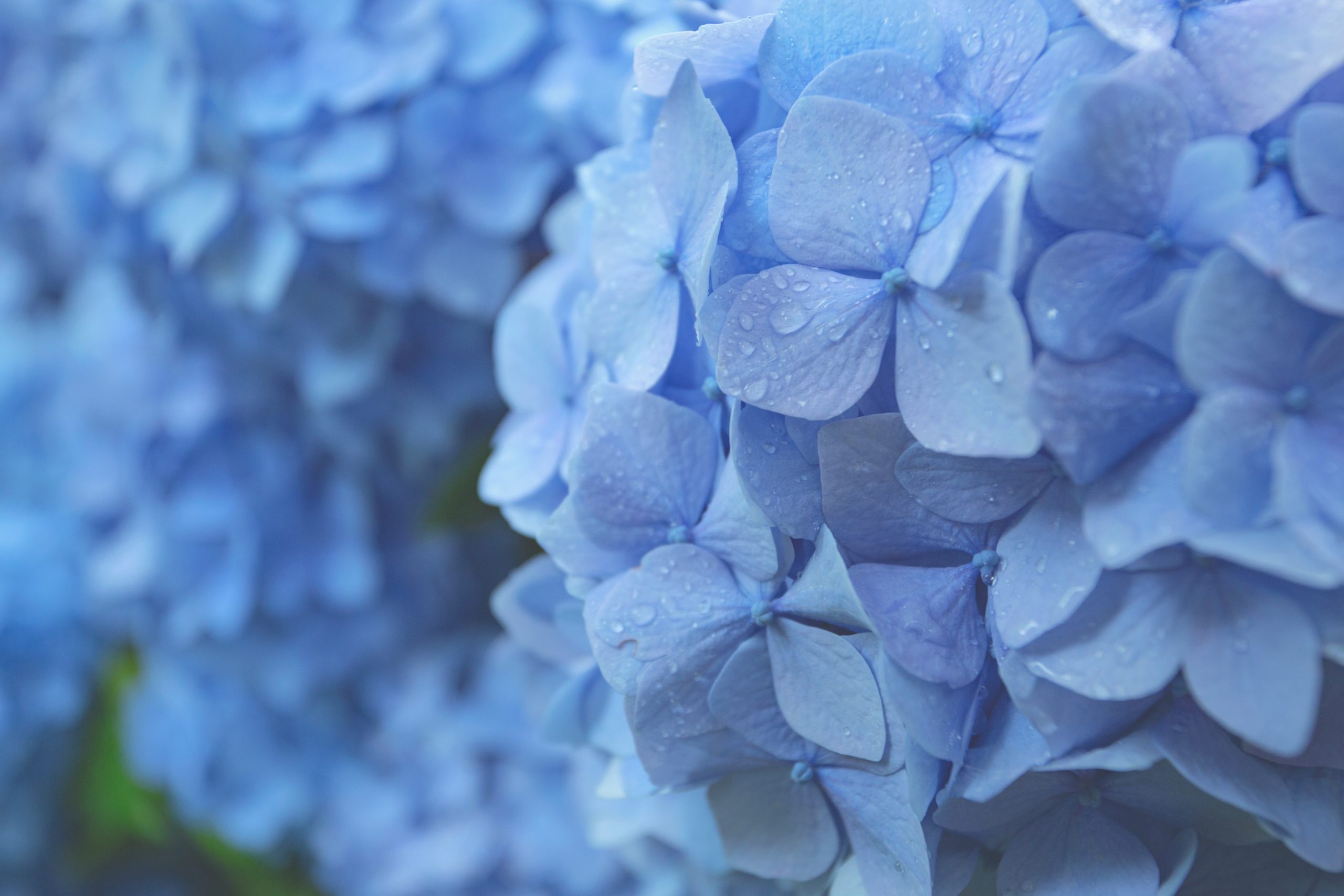
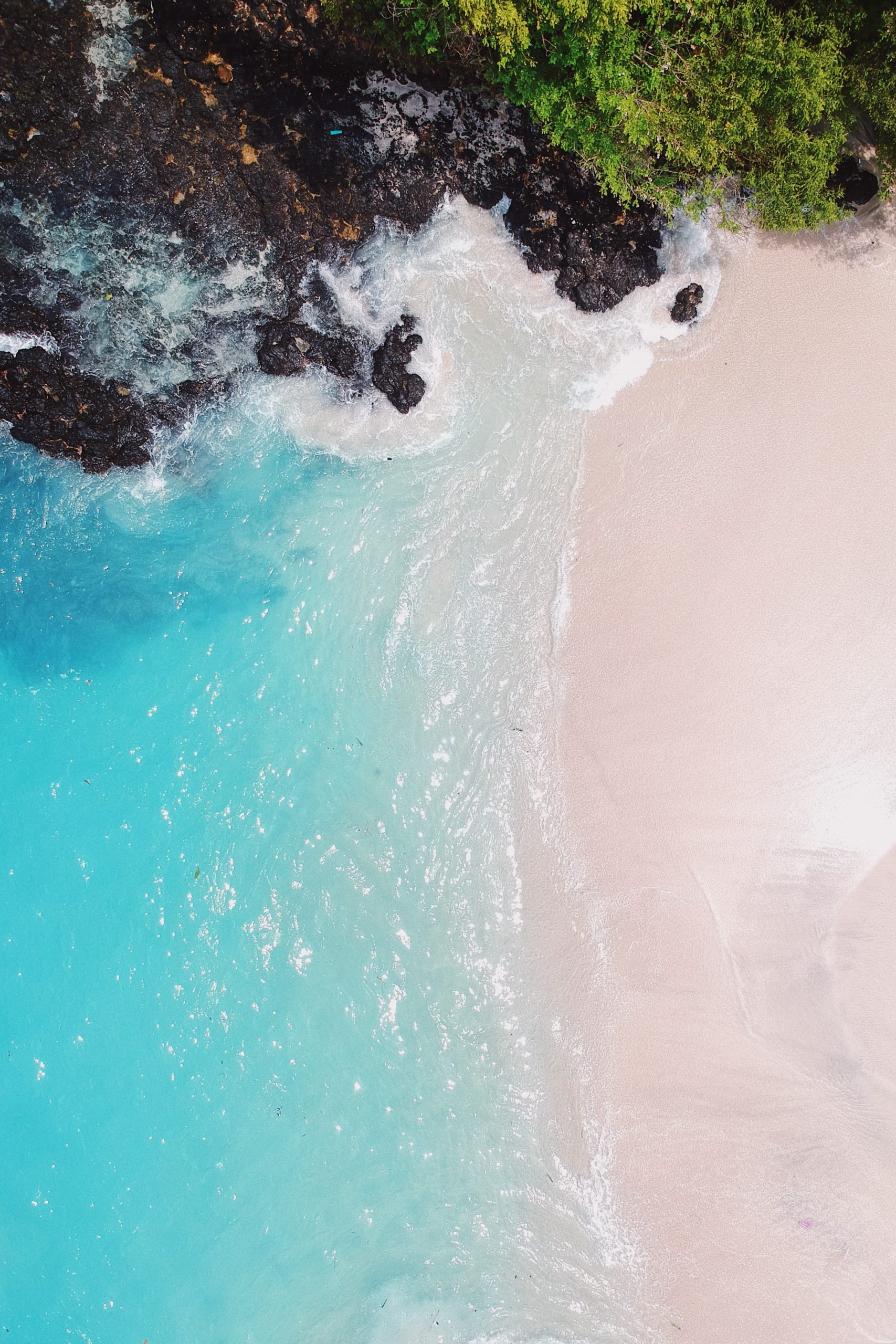
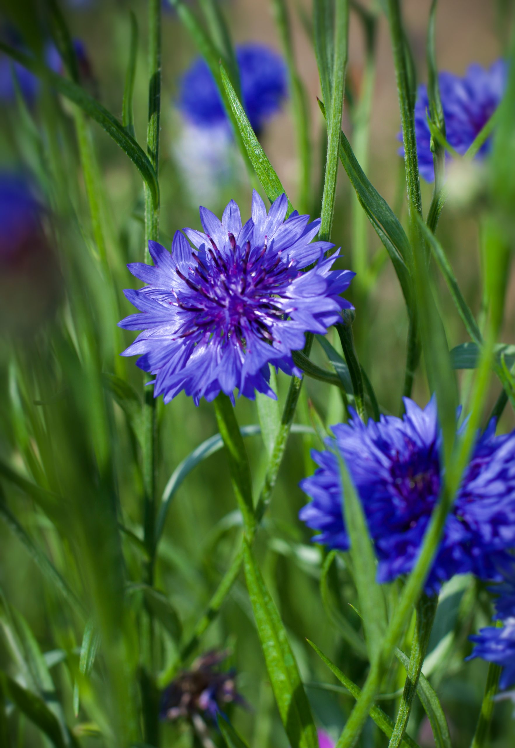
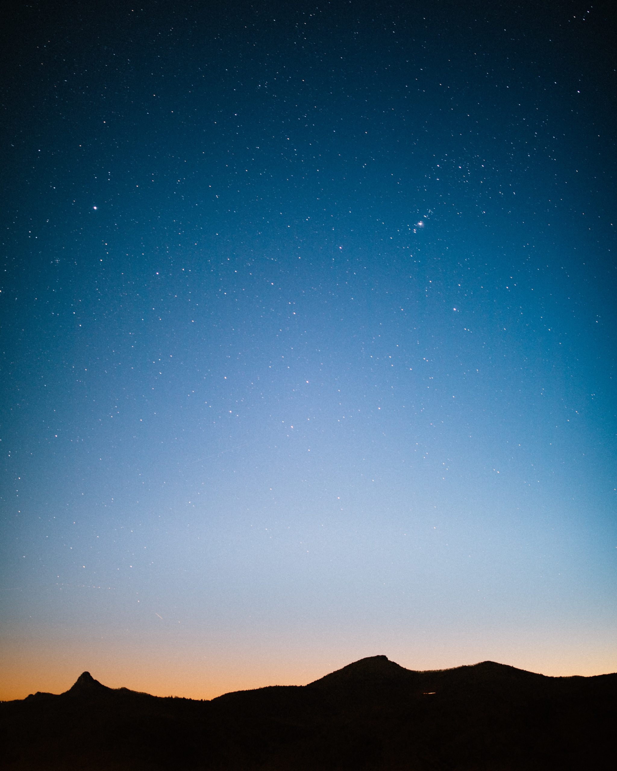
Is it the beautiful soft blue sky? The gentle blue of forget-me-not and hydrangea flowers? The sparkling blue of the ocean? The rich blue of cornflowers? Or the deep indigo blue of the evening sky?


Blue, in all its shades and tones has a calming effect, great for releasing stress and tension. Think of lying on the grass and looking at the blue sky – do you feel tense or relaxed?
Blue can also promote communication, bring clarity, allows for emotional expression and to speak your personal truth.
Lighter tones are better for children as darker blues can be too heavy. Deep rich blues bring an elegance and sophistication to your colour scheme. With any colour, too much blue can be overwhelming, and too much dark blue can bring your energy levels down. Including other colours and textures will keep your colour scheme well balanced.
Do you know the saying “blue and green should never be seen”? If you use the right tones and shades of blue and green, the result can look amazing. See below for an image of the aurora borealis.
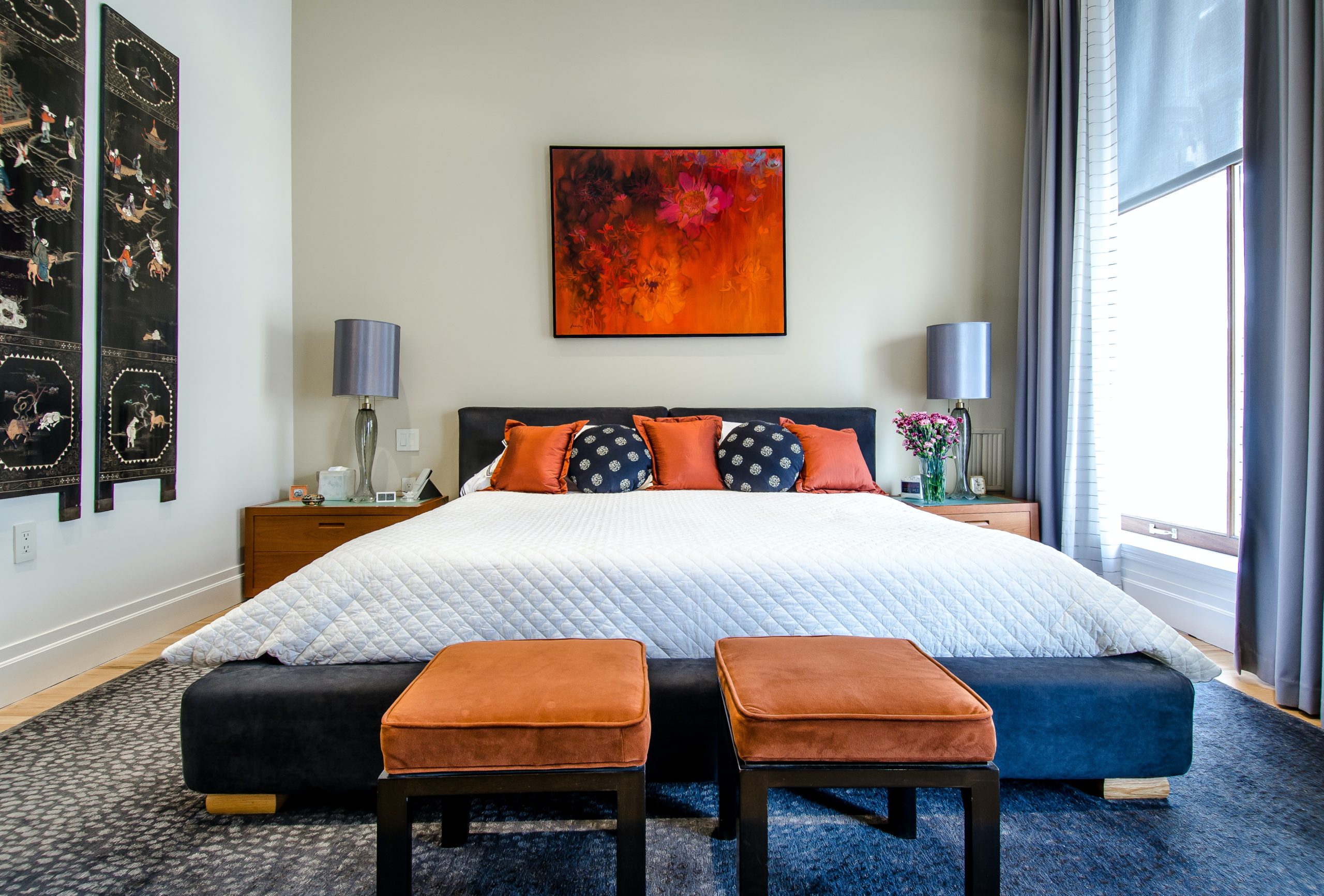
Here’s an example of using blue.
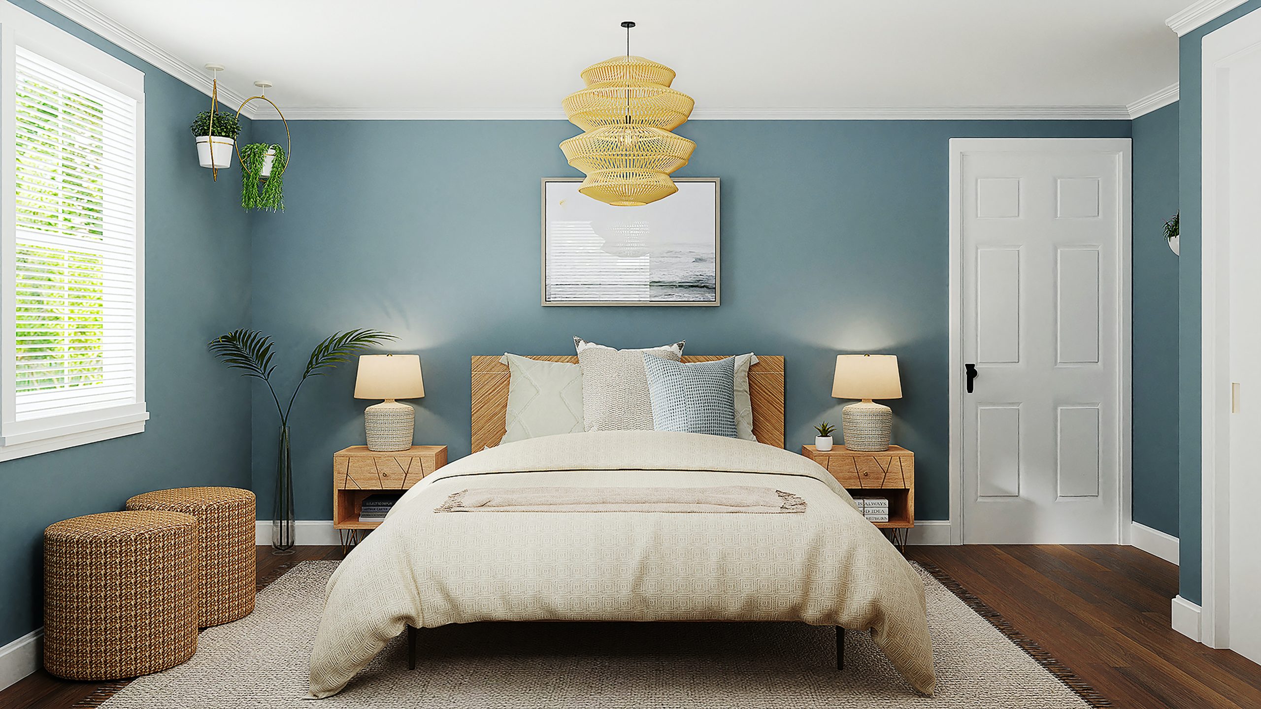
This was a project for a young lady who was 8 years old at the time – a colour scheme and reading corner for her new bedroom. She chose the wall colour herself – “Arbella”, Haymes Paints from Crocker’s Paint and Wallpaper at Miranda.
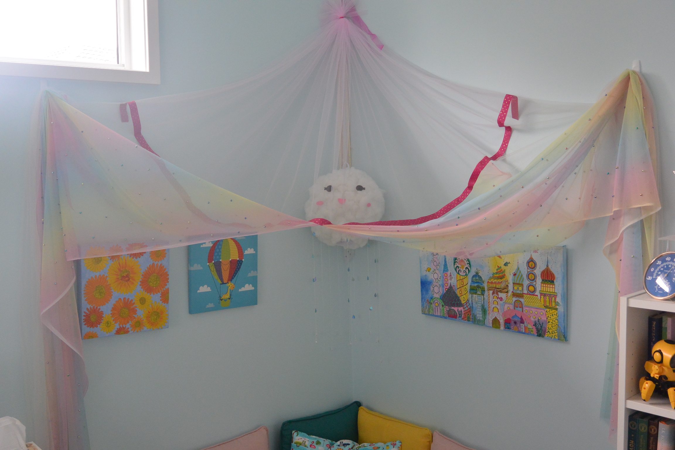
The bedroom is south facing with a south facing window. It has a 2nd west facing window (seen in the top left of the photo). In Australia, this brings in the hot summer sun. In winter is brings in essential warmth and light.
“Arbella” is a beautiful warm blue that works – all walls are painted blue. The room feels friendly and calming, has a warmth with the light brown carpet, and a freshness with the contrasting white skirting, door, window frames and bookcases. This hue of blue has the ability to work with a rainbow of colours without being overpowering, giving each colour it’s own personality.
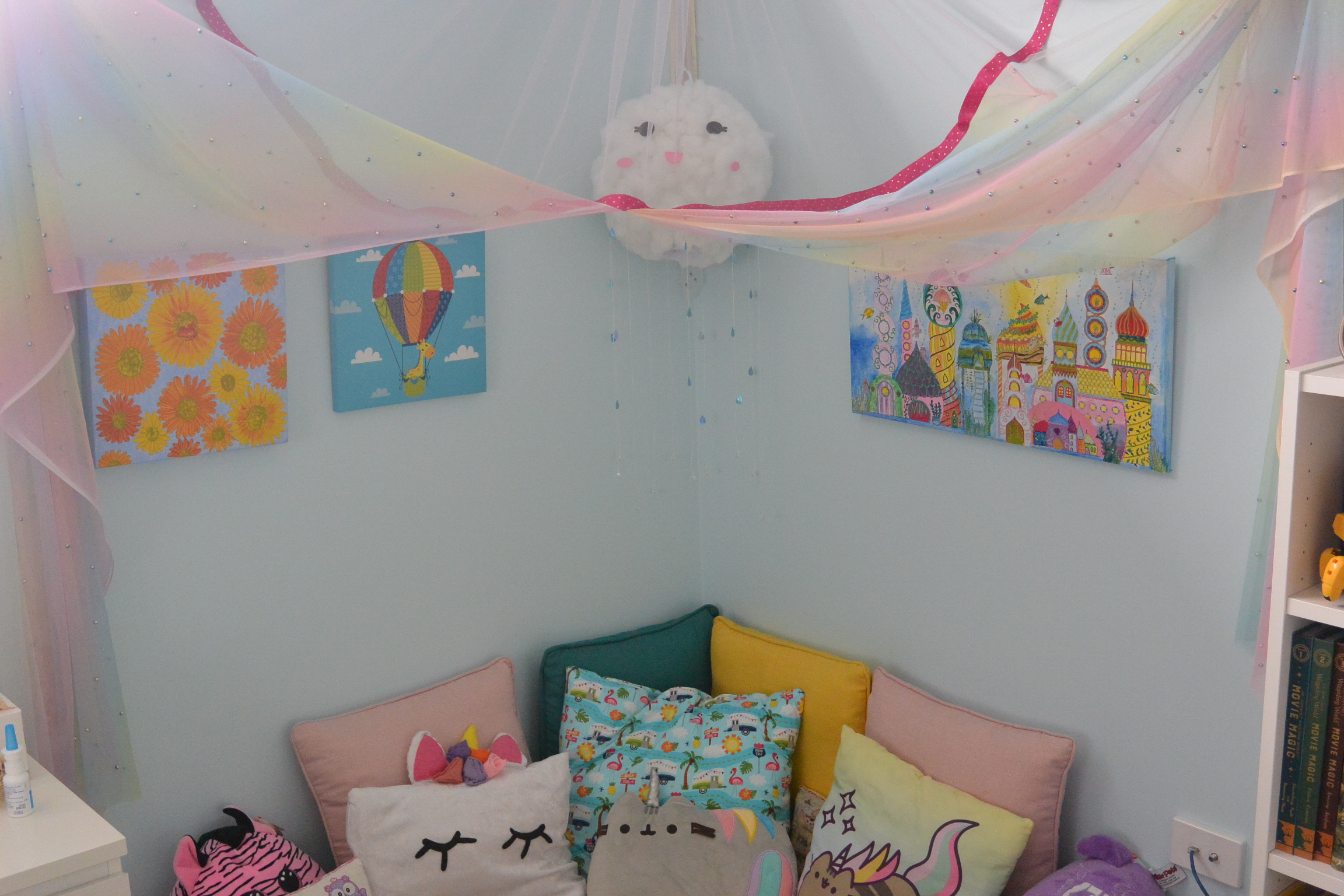
The reading corner has gone through a transformation with the young lady, who is now 11, wanting to add her unique style by choosing her cushions and paintings to make it her own. “Arbella” has grown up with our young lady and has the longevity of lasting a few more years to make it teenager friendly by changing the soft furnishings.
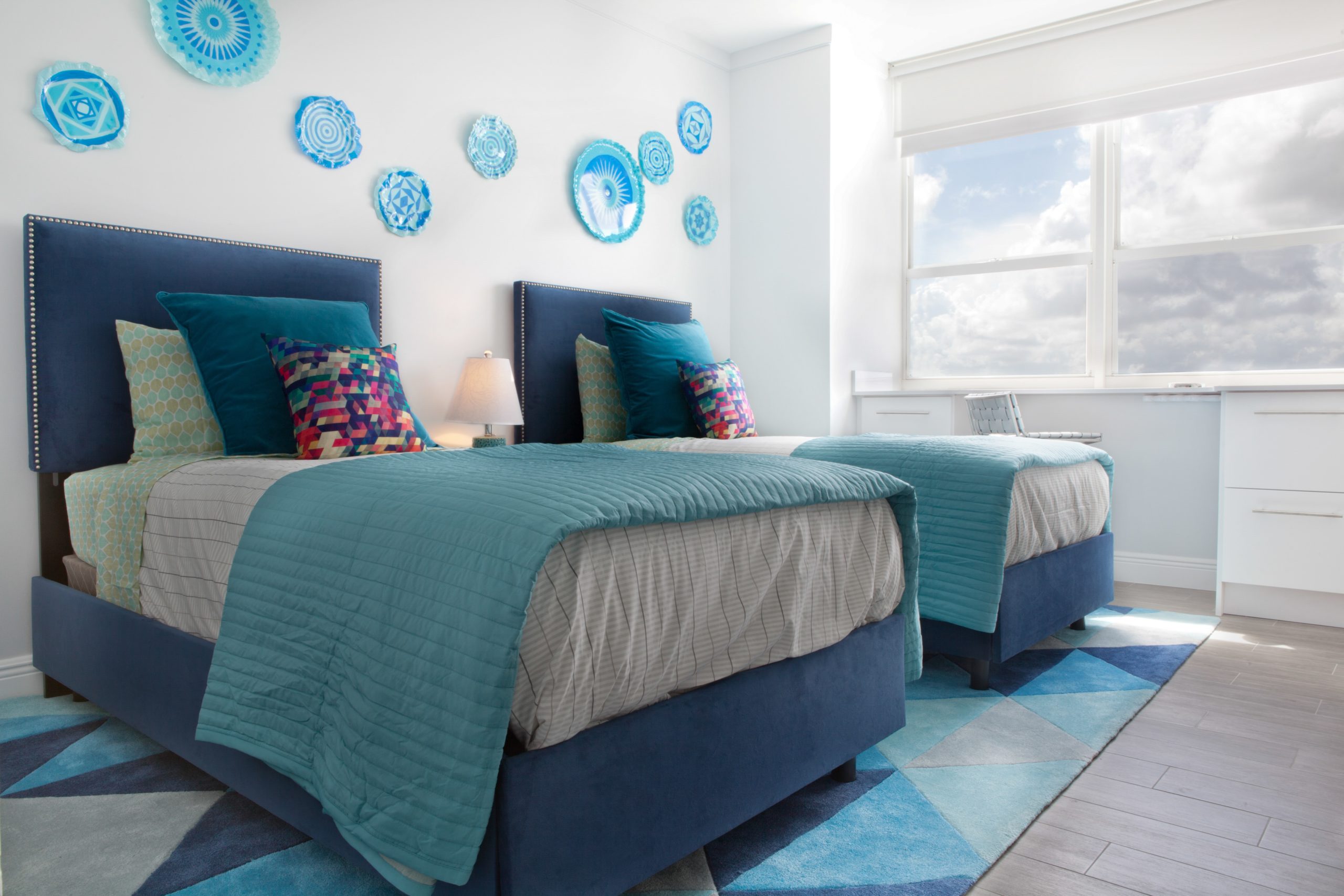
If you’re thinking of painting, pick up some colour samples from your local hardware store and sit with them for a while. Feel if that colour resonates with you, and if it’s suited the aspect of the room (the direction it faces), and the amount of natural light. Blue can be a great base to add other colours. Here are some examples.
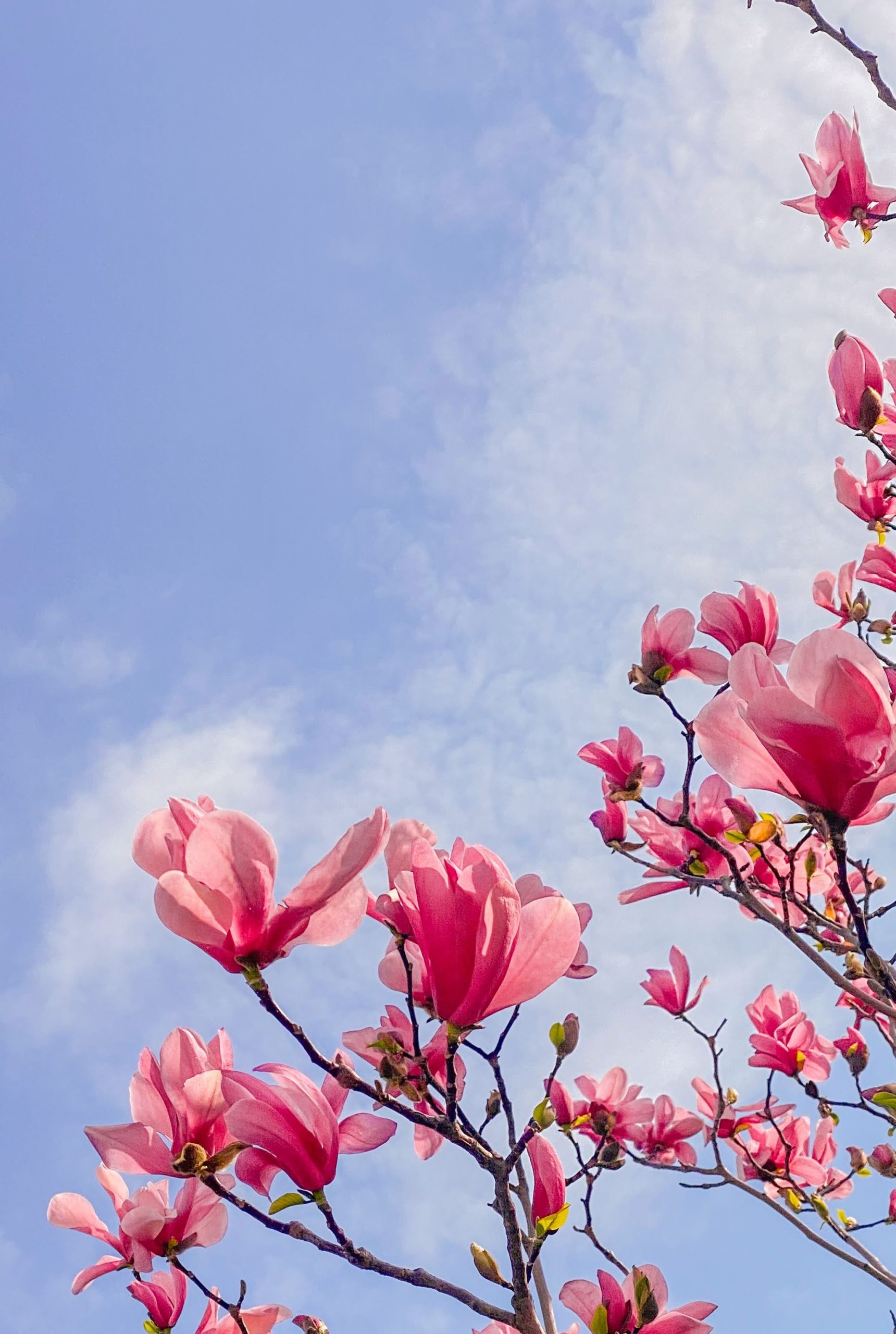
Be inspired by nature and the colour combinations you see. The aurora borealis has a magnificent combination of blues and greens and the pink magnolia shows up brightly against the soft blue sky.

The essential part of using colour in decorating is to choose colours that feel like you, that you feel supremely comfortable with, and encourages you to be in that space. Whether you paint walls, or decorate with soft furnishings, try using some blue to bring in a feeling of calm into your life.
Discover more about easy ways to add colour to your home in my e-book “The Insider’s Guide to Decorating with Colour”