Colours are subtle and most people are unaware of how they can change your mood, and then how you’re feeling. Colour psychology is always used commercially. Take a large food chain with the letter “M”. Most people will know the colours are yellow and red, these were chosen for a reason – red for energy and excitement and like a stop light, yellow for feeling good and positive energy. Kids are always super excited when see the M and want you to stop. Brilliant use of colour psychology.
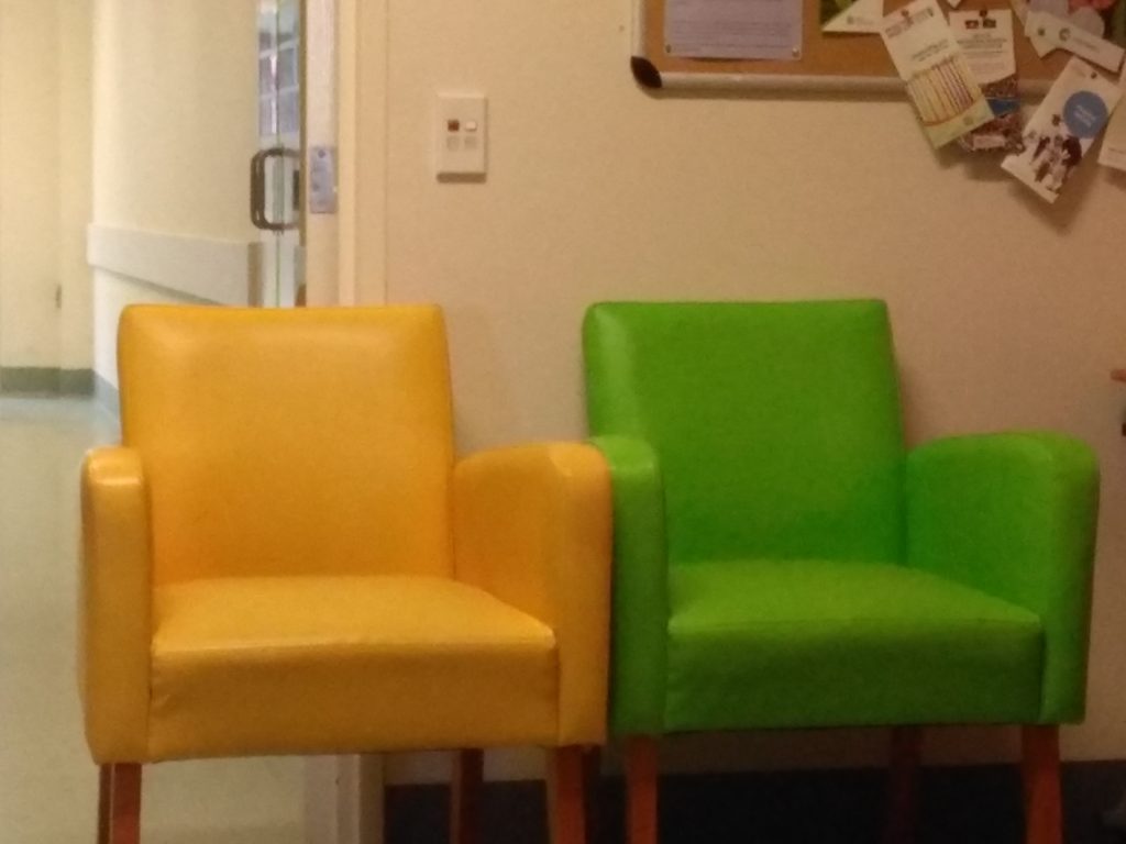
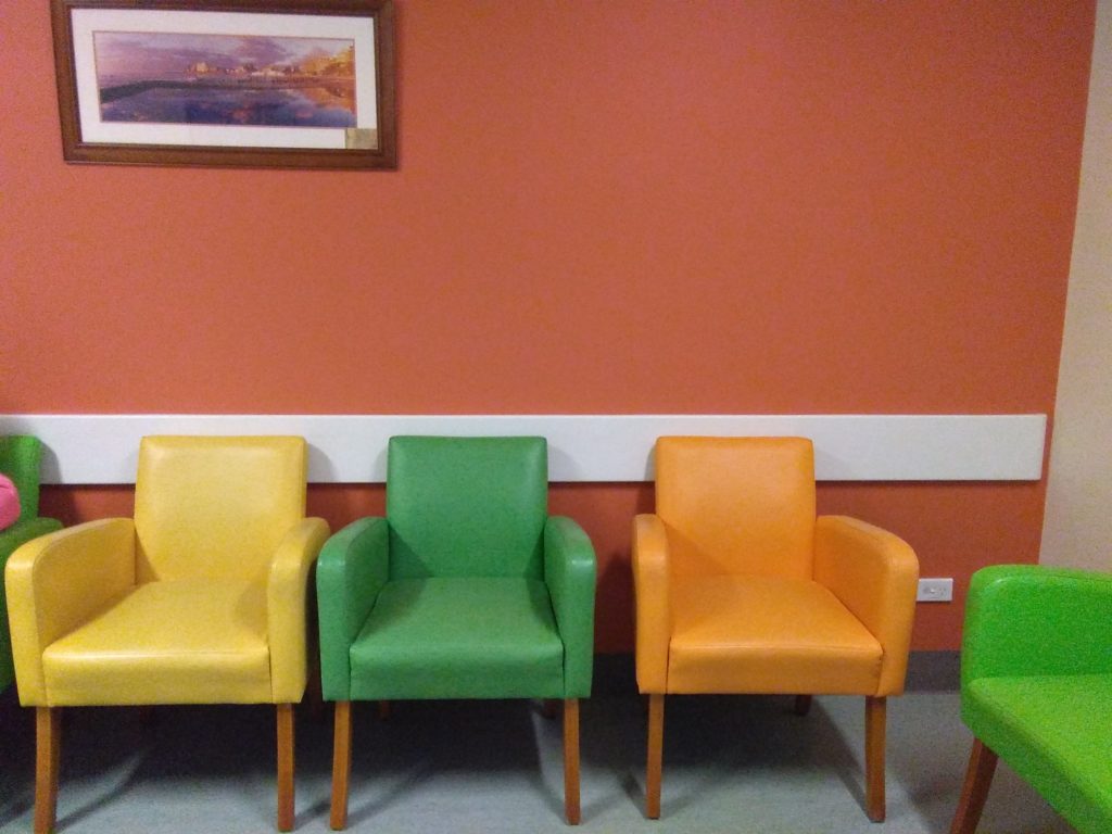
These first images are from the waiting room of an ocology (cancer) treatment ward in a hospital. The colours are bright, happy feel good colours. If you’re being treated there, you want to feel upbeat and positive to help the treatment and healing process.
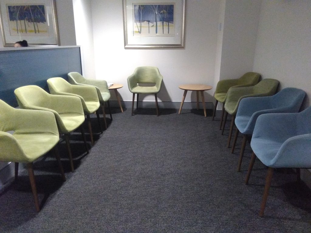
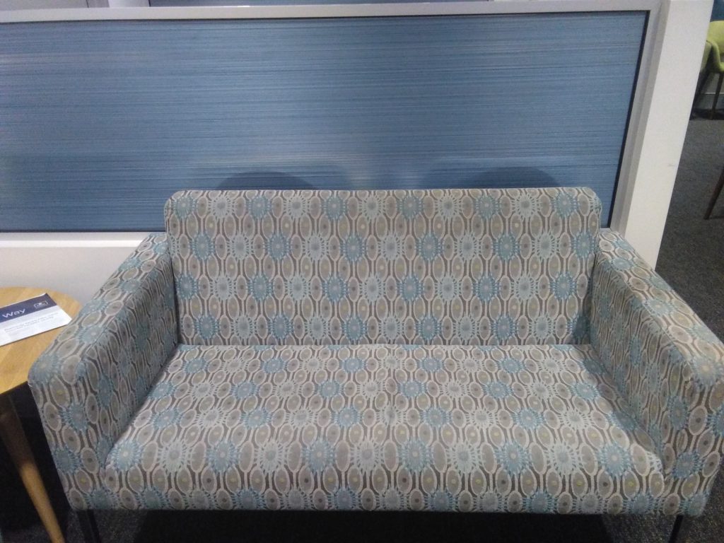
By comparison, these photos are from a waiting room at a hospital for Admissions. How do you feel waiting to be admitted to hospital? Possibly nervous and unsure? They have used calming, light tones of blue and green, like looking at the sky and calming fields. Blue and green together are balancing, create feelings of harmony, peace and calm. Imagine waiting for a long period of time in Admissions if it had the bright colours above? There’s too much energy in the colours. And imagine waiting with a child, they’d be running around nonstop!!
You can use colours in the same way at home. If you want lots of energy, use sunny bright colours – great for a living room where you have guests or a dining area to promote conversation. For a bedroom that is calm and serene giving you or your child a restful night’s sleep, use the calmer, gentler tones.
Think about the feeling or atmosphere you want to create, then think of the right colours to use and you will create the most amazing space for you.