Marketing companies spend big bucks on getting colours right to sell their product service by changing the way you feel, be it in a big way or a small way.
There’s an interesting case near me that I wanted to share, a simple use of colour to change the way a building feels.
We knew a daycare centre was being built and watched the progress from the foundation up. It was an interesting build – on a corner block and the road was quite busy, wondering how the design would work out.
When the end of the build was near I was taken aback, the grey concrete bricks weren’t rendered over, they were left as grey bricks and the clad sections were left white. Looking at it didn’t give me a warm fuzzy feeling to leave a child there and I was amazed it was finished like that.
Then, voila, one day the sign was put up, full of colour and the posts near the front entrance were painted rainbow colours. It made such a difference. 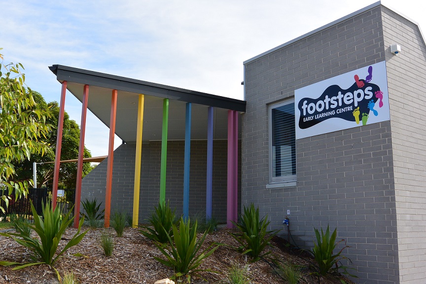
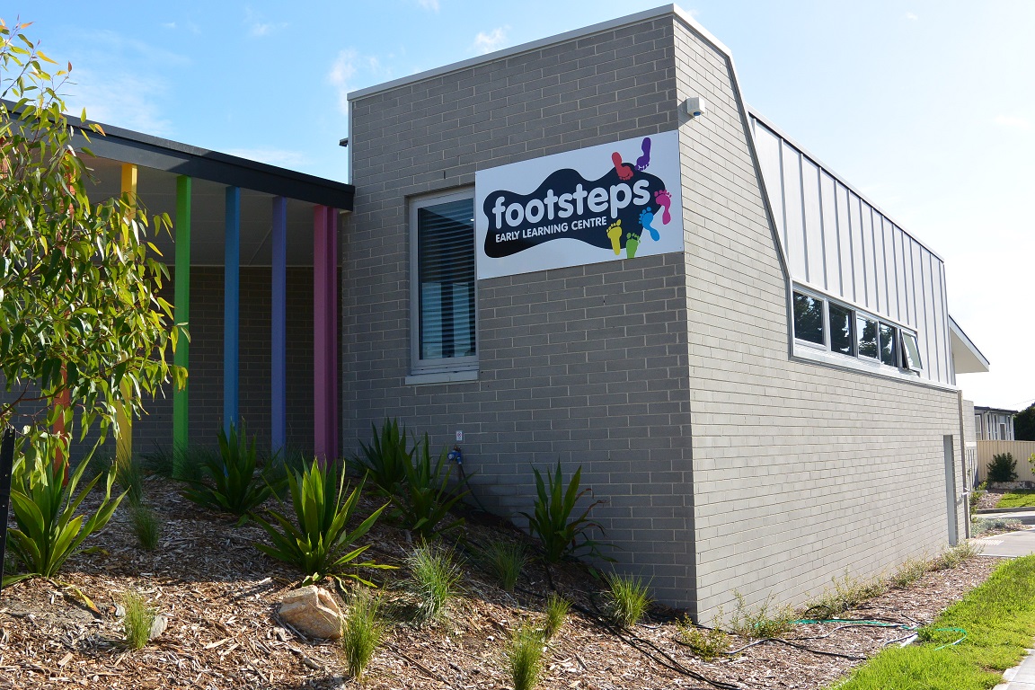
Childcare centres should have a solid appearance giving reassurance to the family of responsibility taken seriously for looking after they’re child. They should also show some lightheartedness reassuring parents they’re kids are left in a fun environment.
Can you imagine if the coloured posts were painted brown/grey/white or blue? The feel would be more sombre, a feeling you would get from a solicitor or doctors office.
The rainbow colours of the posts and the sign are like a flash of sunshine on an otherwise grey building. It looks like a fun and fantastic place for kids to go each day.
Take note next time you’re out and about. What colours draw you in and what colours make you turn away?