Green and blue vs yellow and orange


Even though it’s autumn in Sydney, Australia, it feels like the middle of summer. On Monday we hit 37 degrees celsius – the warmest day in a long time.
Thinking about colour schemes, I thought it might be good to talk about cool and warm colours to give your decor a feeling of coolness. This is especially great if you have a room facing the sun, or with lots of natural light that you want create a cool oasis. To give a good comparison, I have used cushions as examples. Cushions are great as you can easily change the covers around to create the feeling you want in your home. Cooler colours during summer, and warmer colours during winter.
What do you think of when you think of blue?
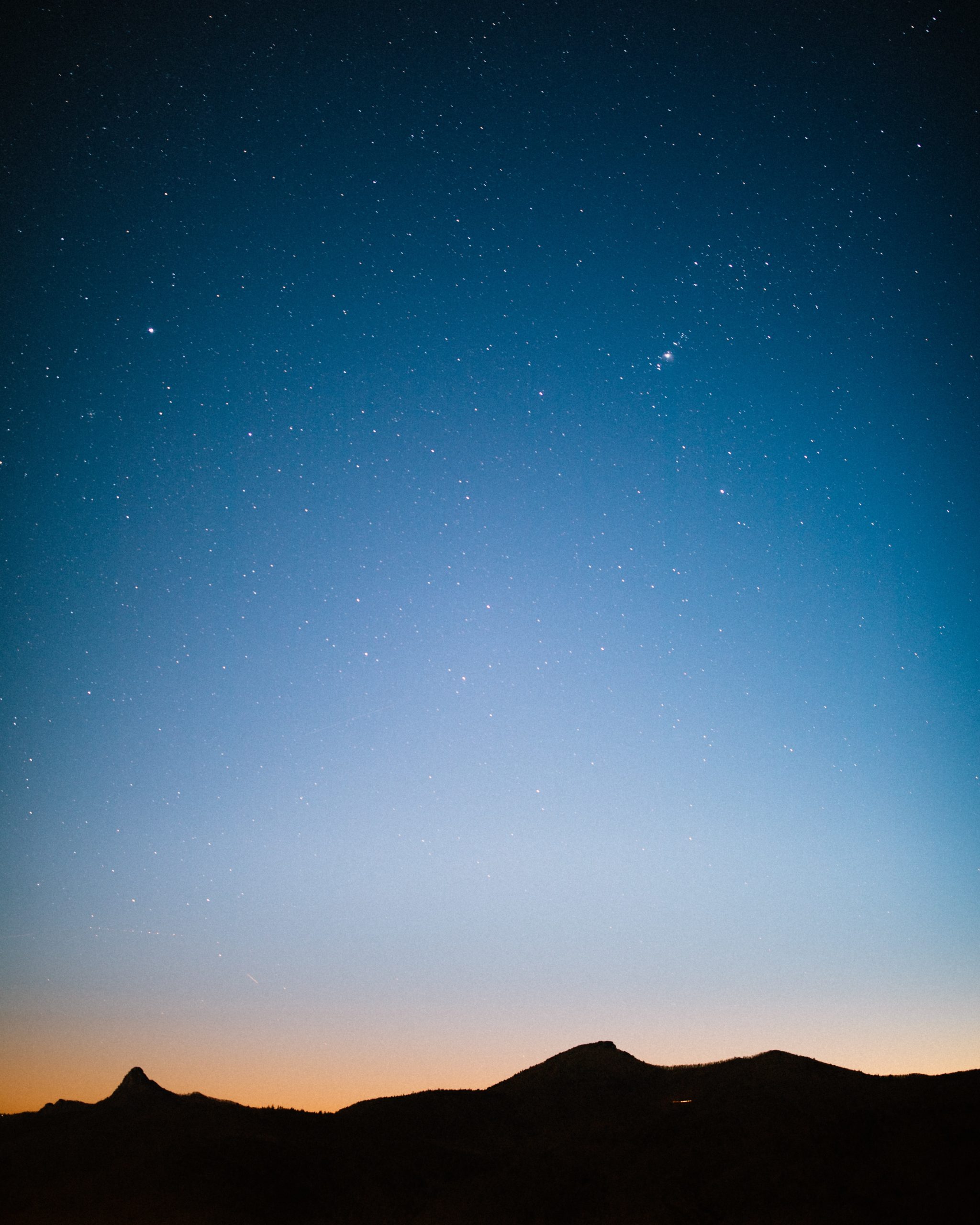
Maybe the ocean, the sky with clouds, the darker evening sky or flowers which come in a amazingly different shades.

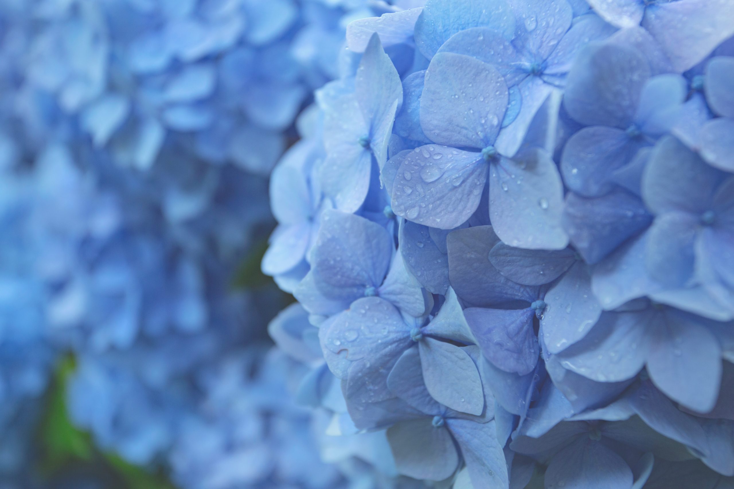

Blue is a primary colour. It is a soothing colour, it calms the mind and the soul. If you think in another perspective of ice. If you have an injury that swollen, that is inflammation, which is hot. The best treatment is an ice pack to cool the inflammation and decrease the swelling. Similar properties to seeing blue around you. Darker blue is a more intense shade and too much is overwhelming and heavy. Small amounts can add elegance to your decor, and it feels solid and dependable – corporate offices often use blue to convey a feeling of solidness and dependability. Paler blues convey a lighter feeling.


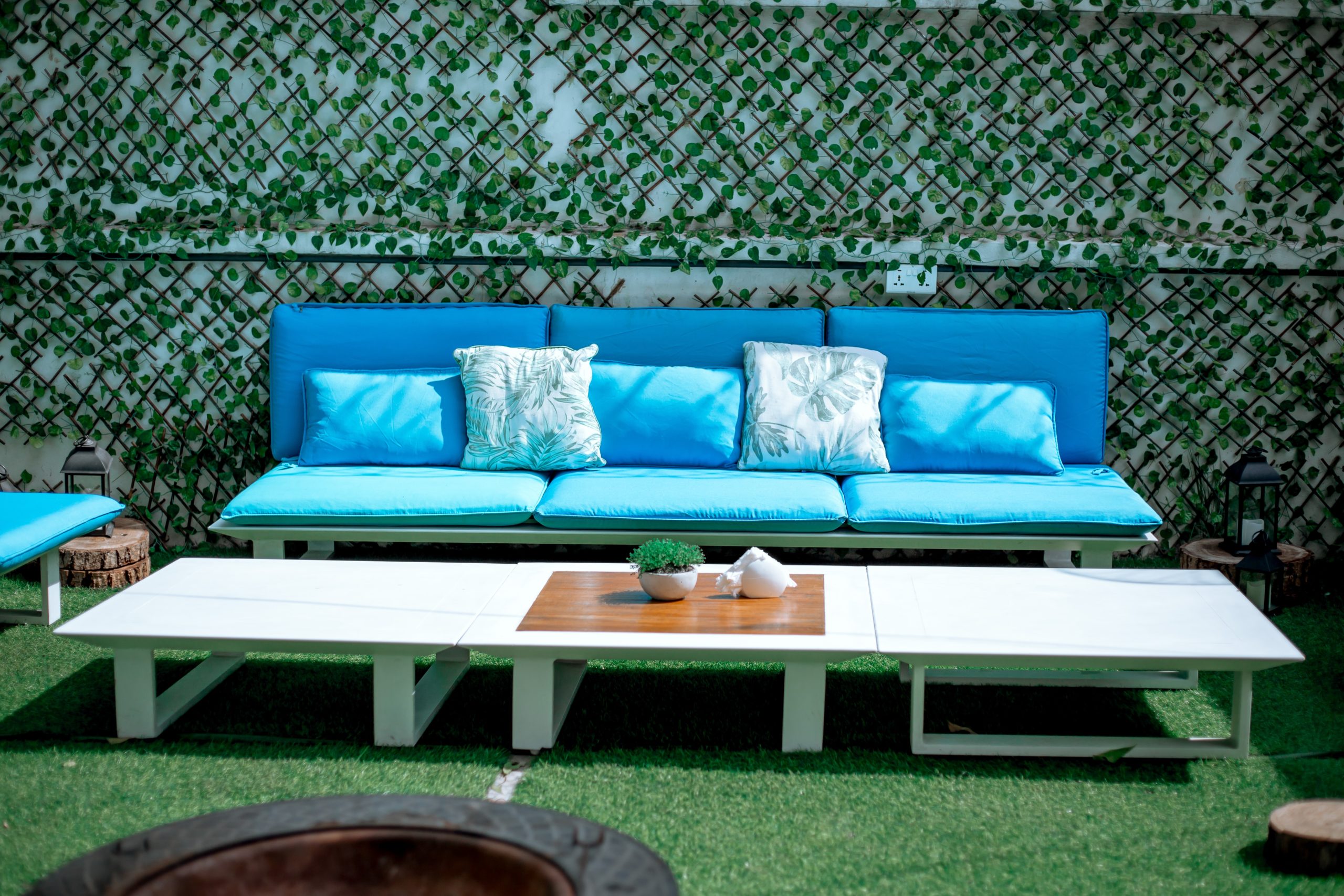
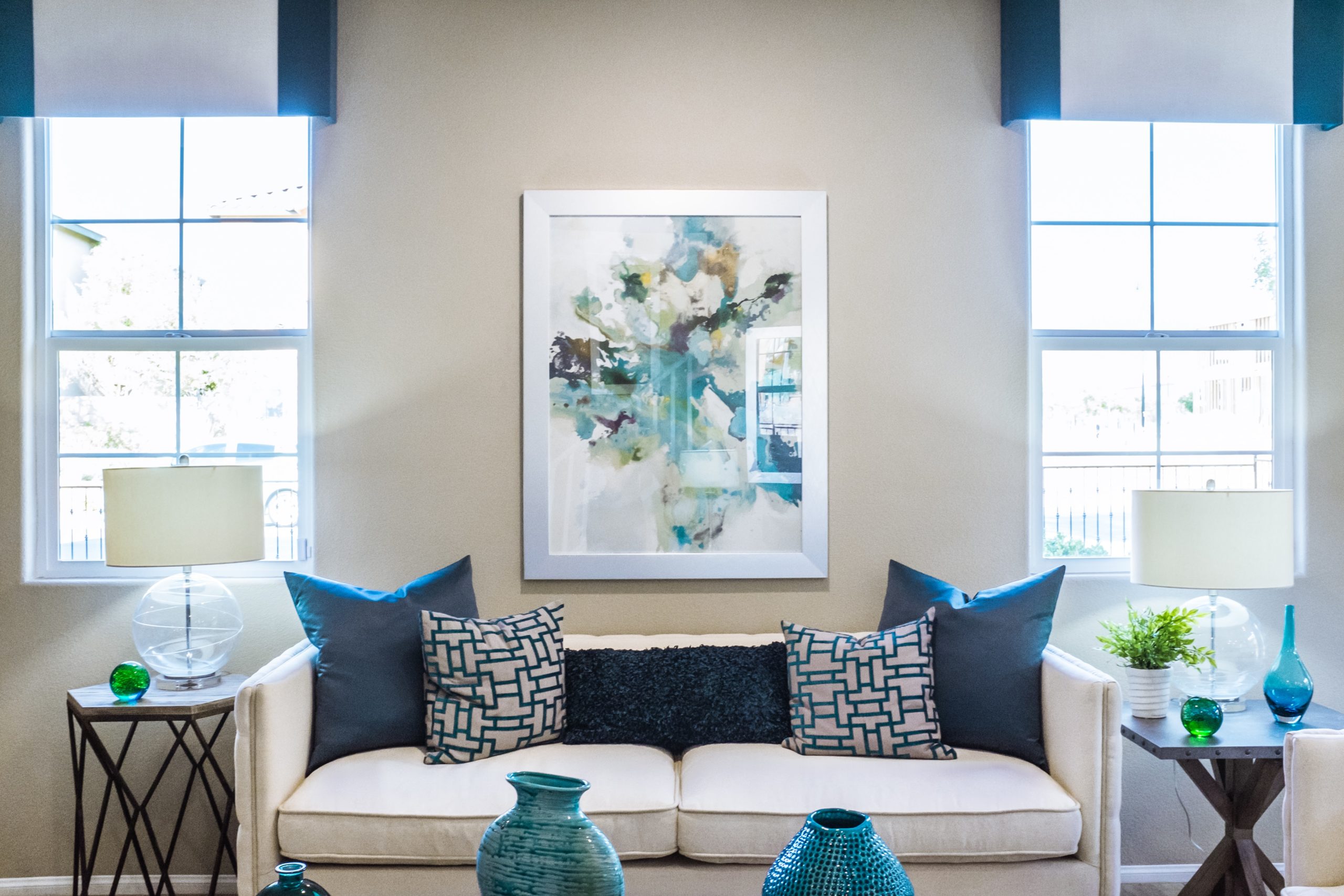
The two living room images above are a neutral base, with blue cushions in varying shades, and blue artwork on the walls. The feeling is soothing, organised and peaceful. The image on the right of the outdoor setting is in full sun, meaning very hot. Having blue cushions gives a feeling of coolness in the heat of the day.
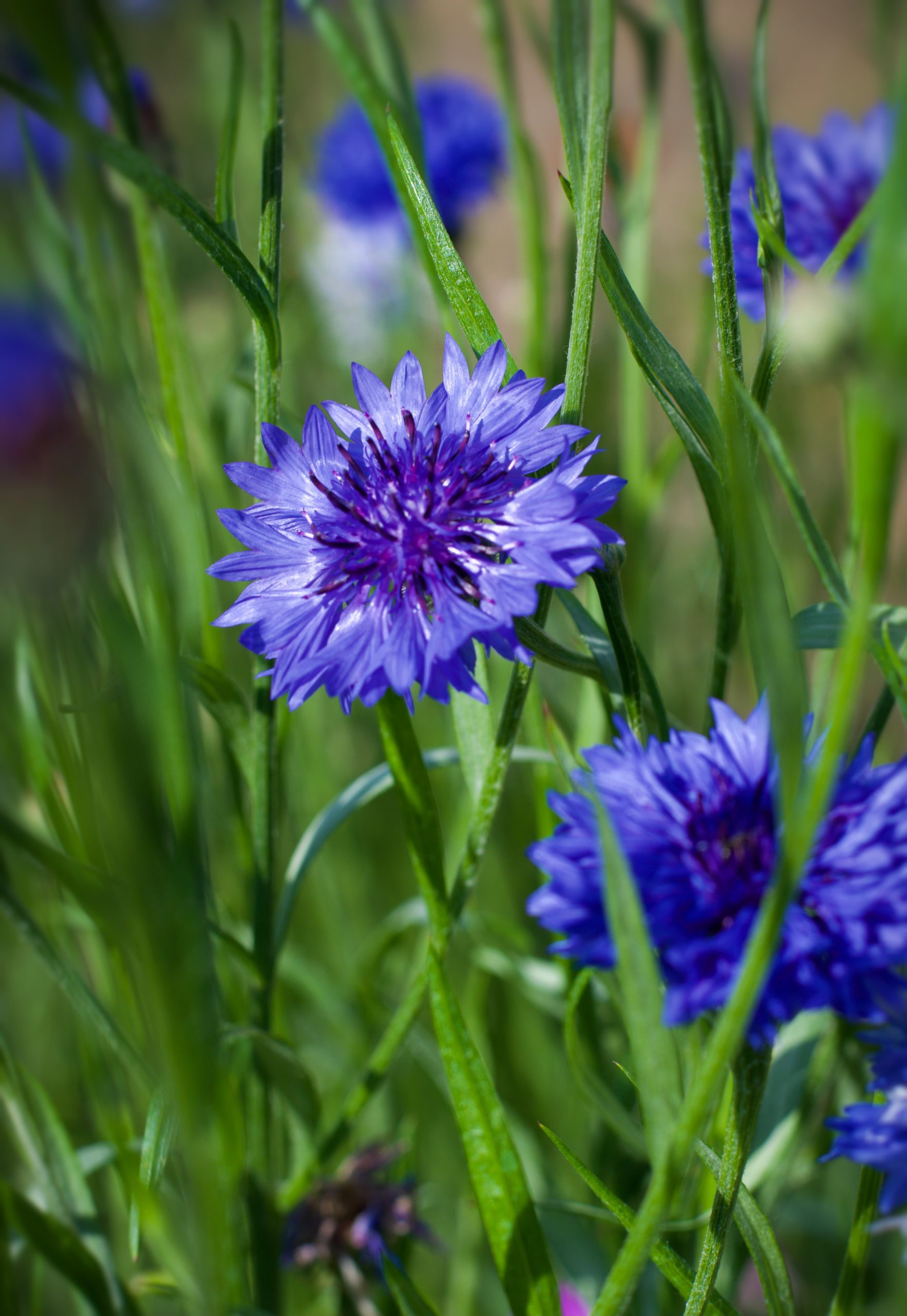
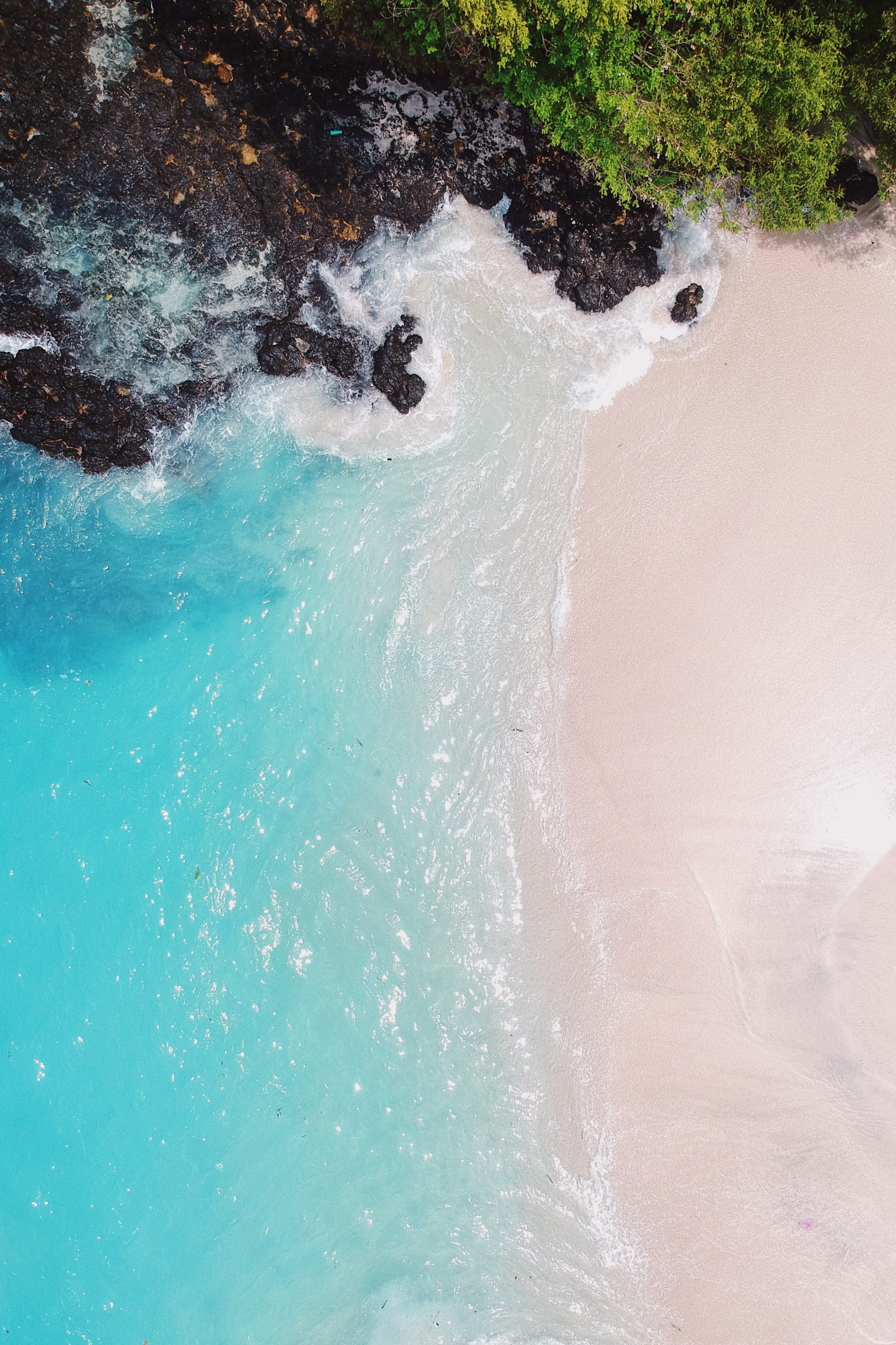
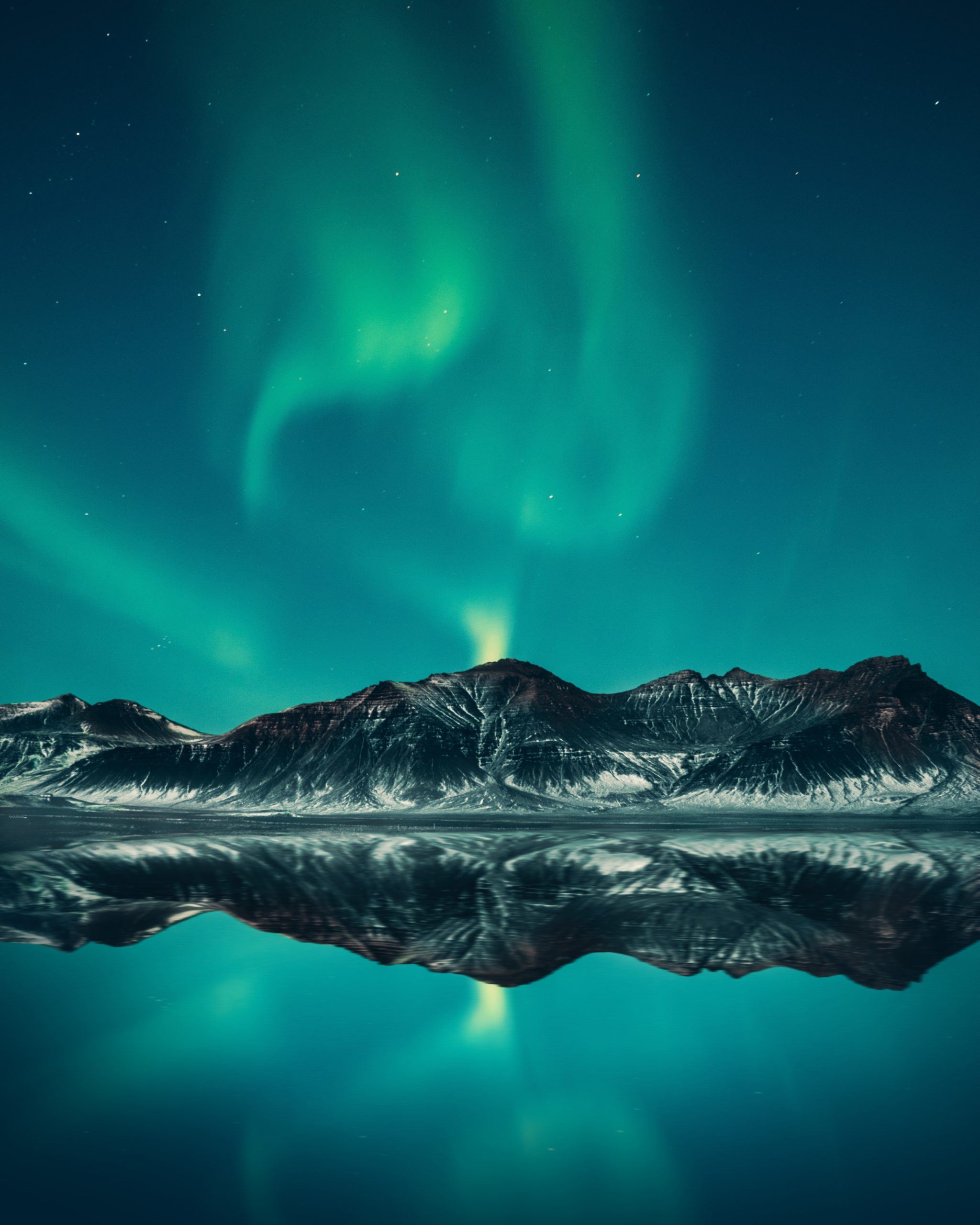
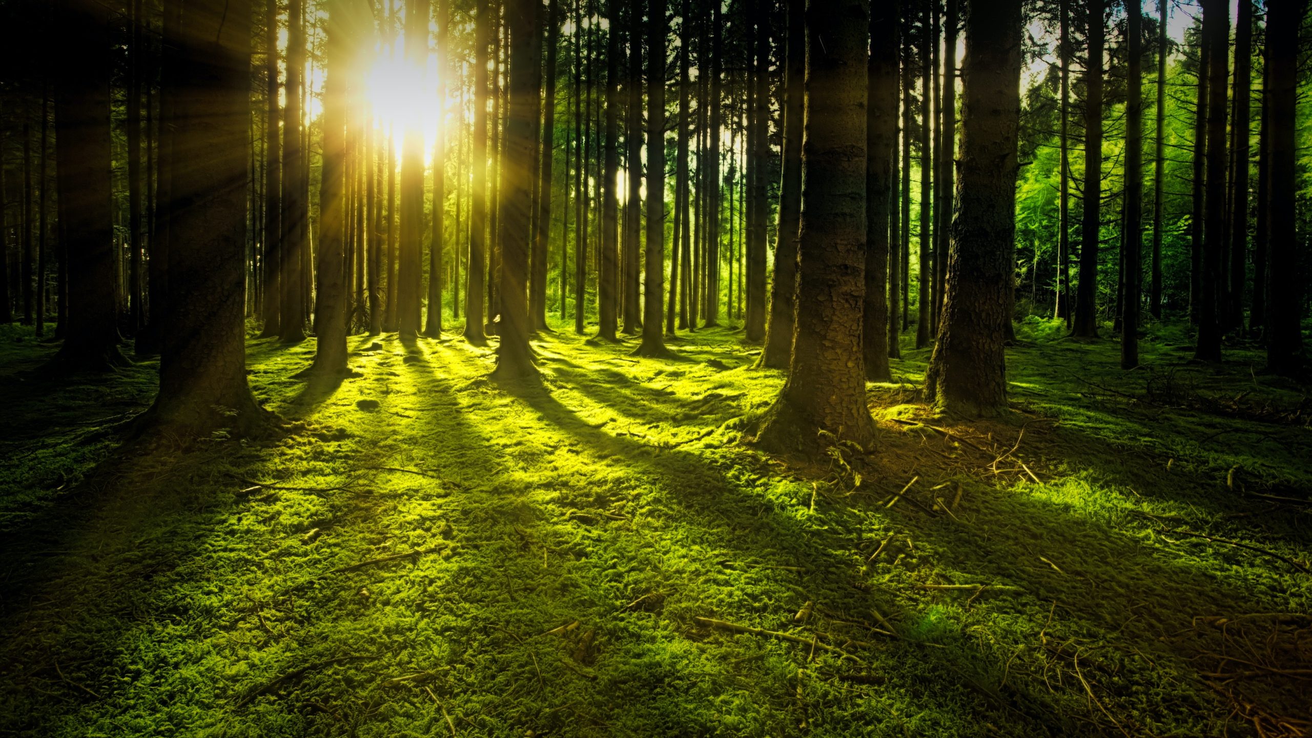
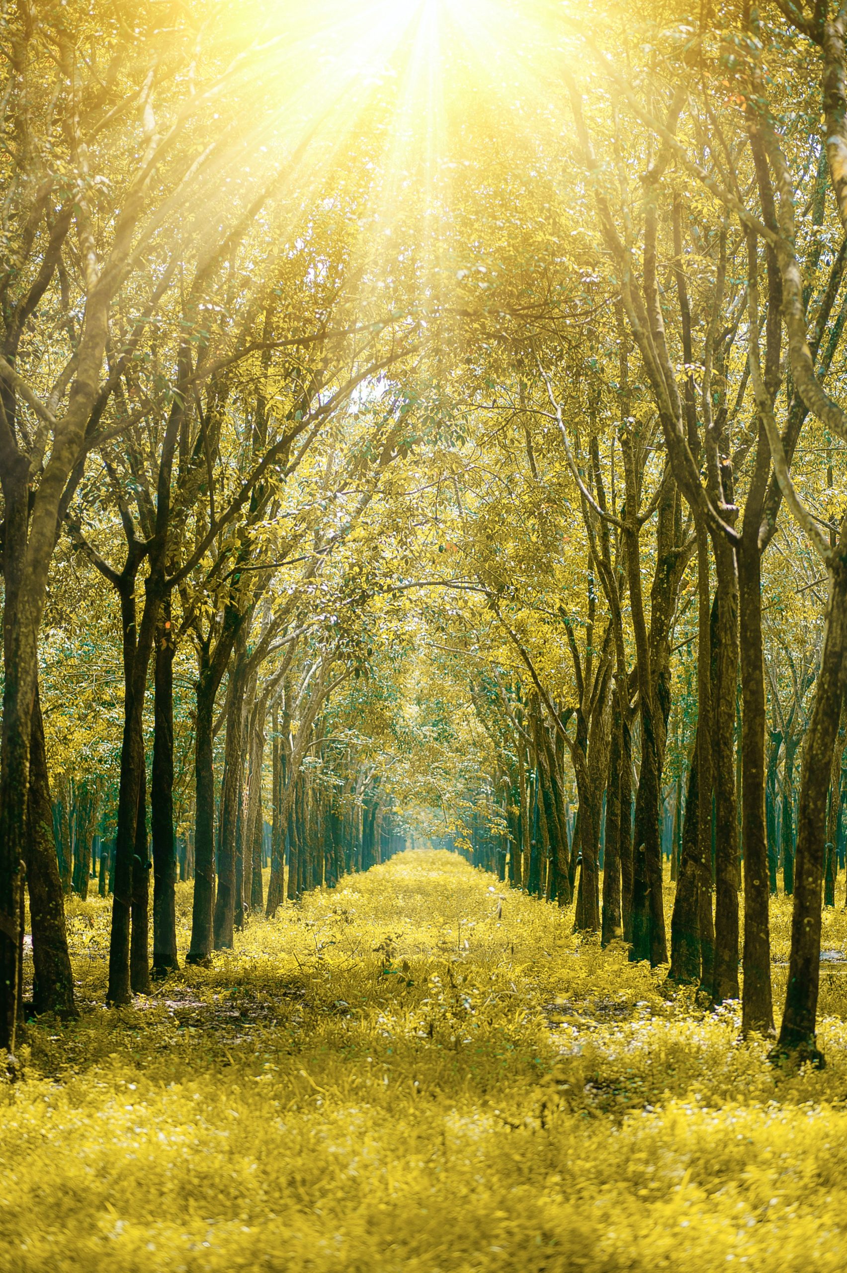
Green is similar to blue. It’s a cool colour – think trees, forests, lush gardens, turquoise, the aurora borealis.
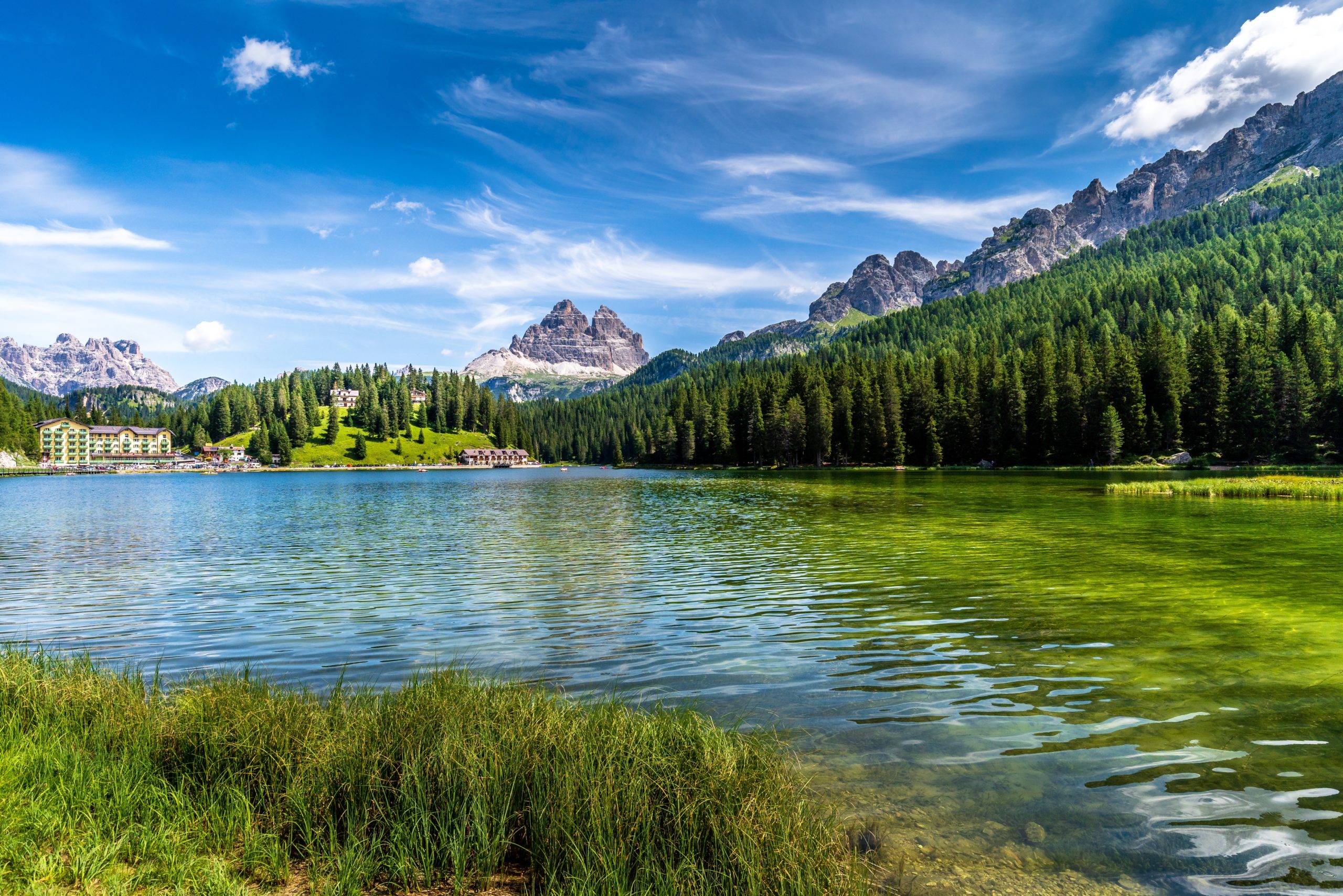
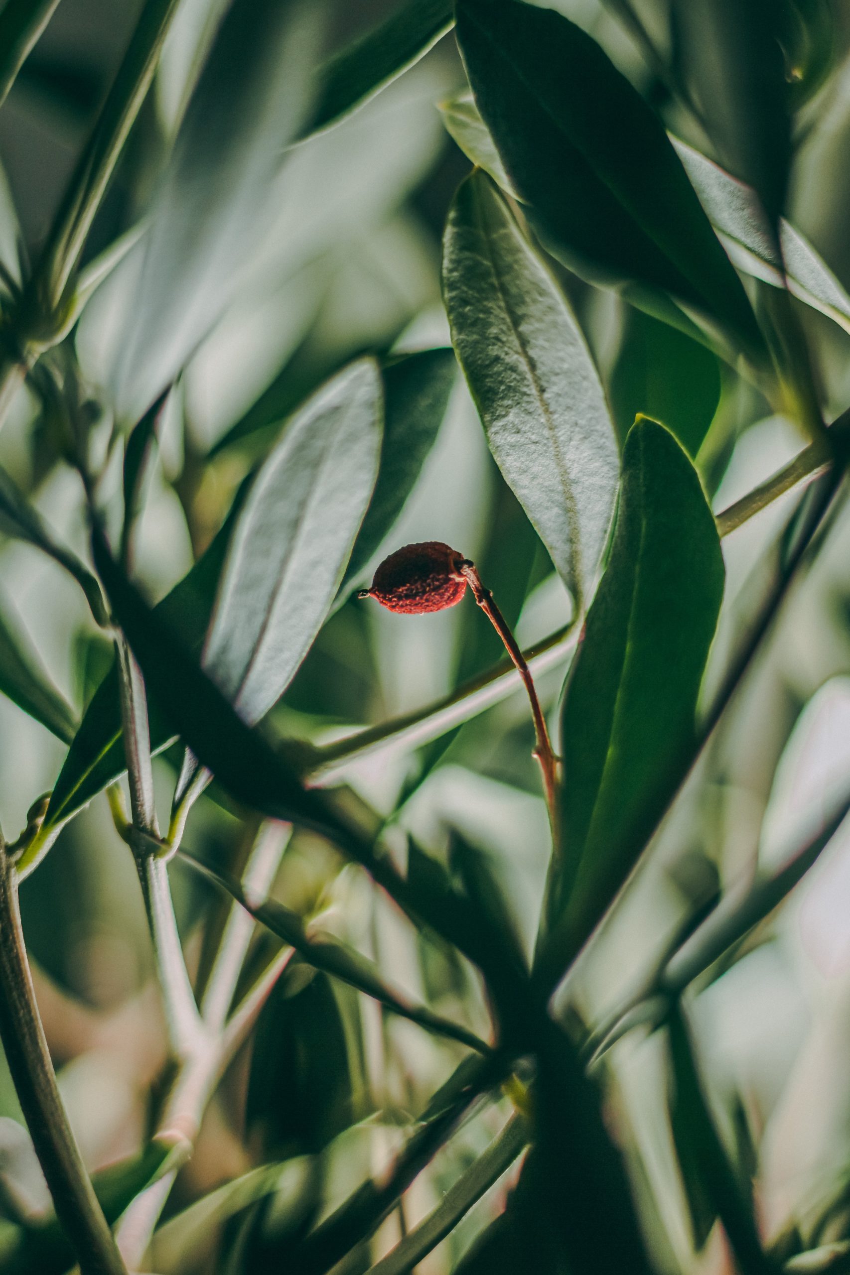

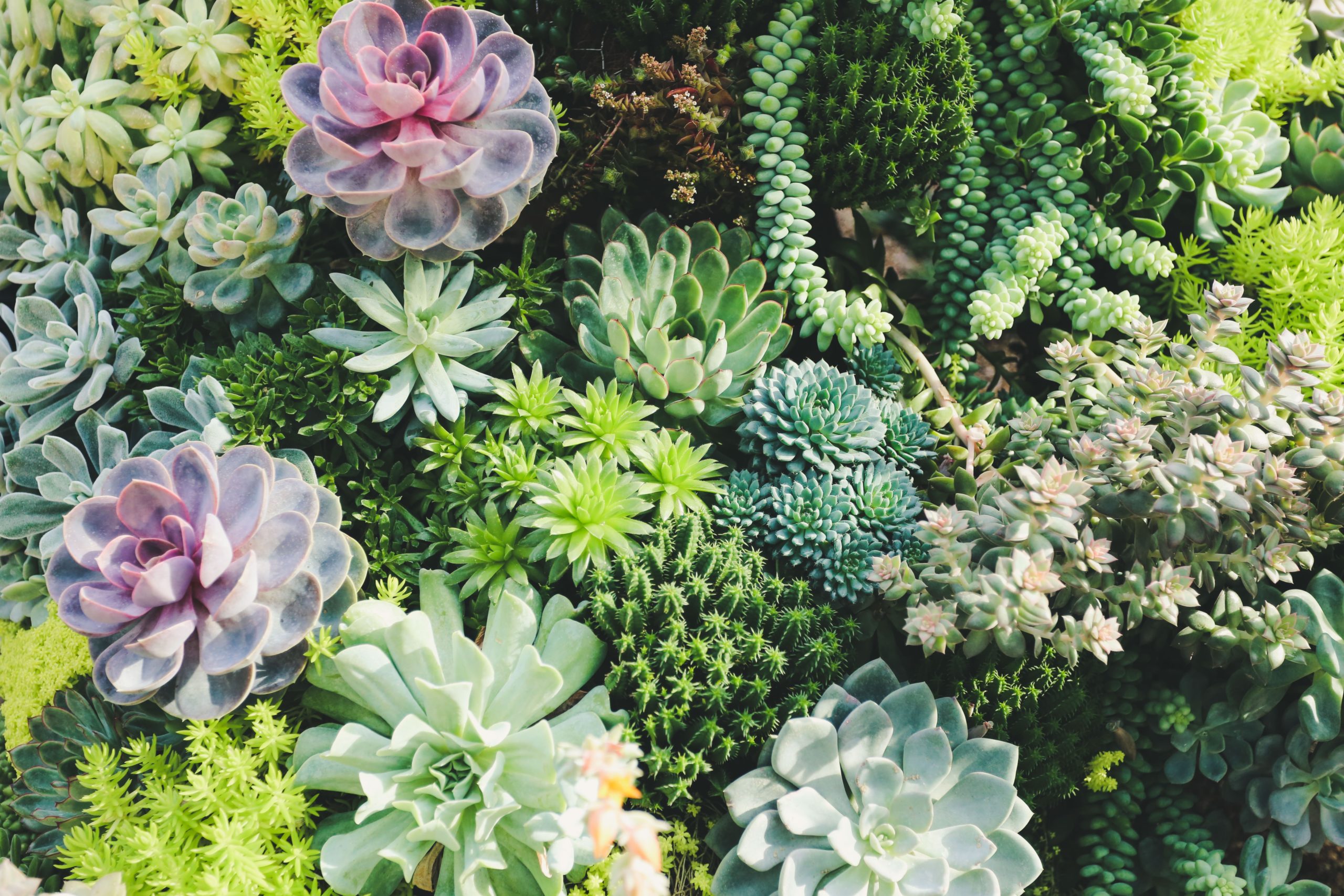
Greens (blue greens, not yellow greens) and related turquoise refreshing, regenerating, harmonising and cooling. Green is new growth and new opportunities, like the new growth on plants. Do you feel better in a walk in the forest surrounded by trees? It feels grounding and comforting.
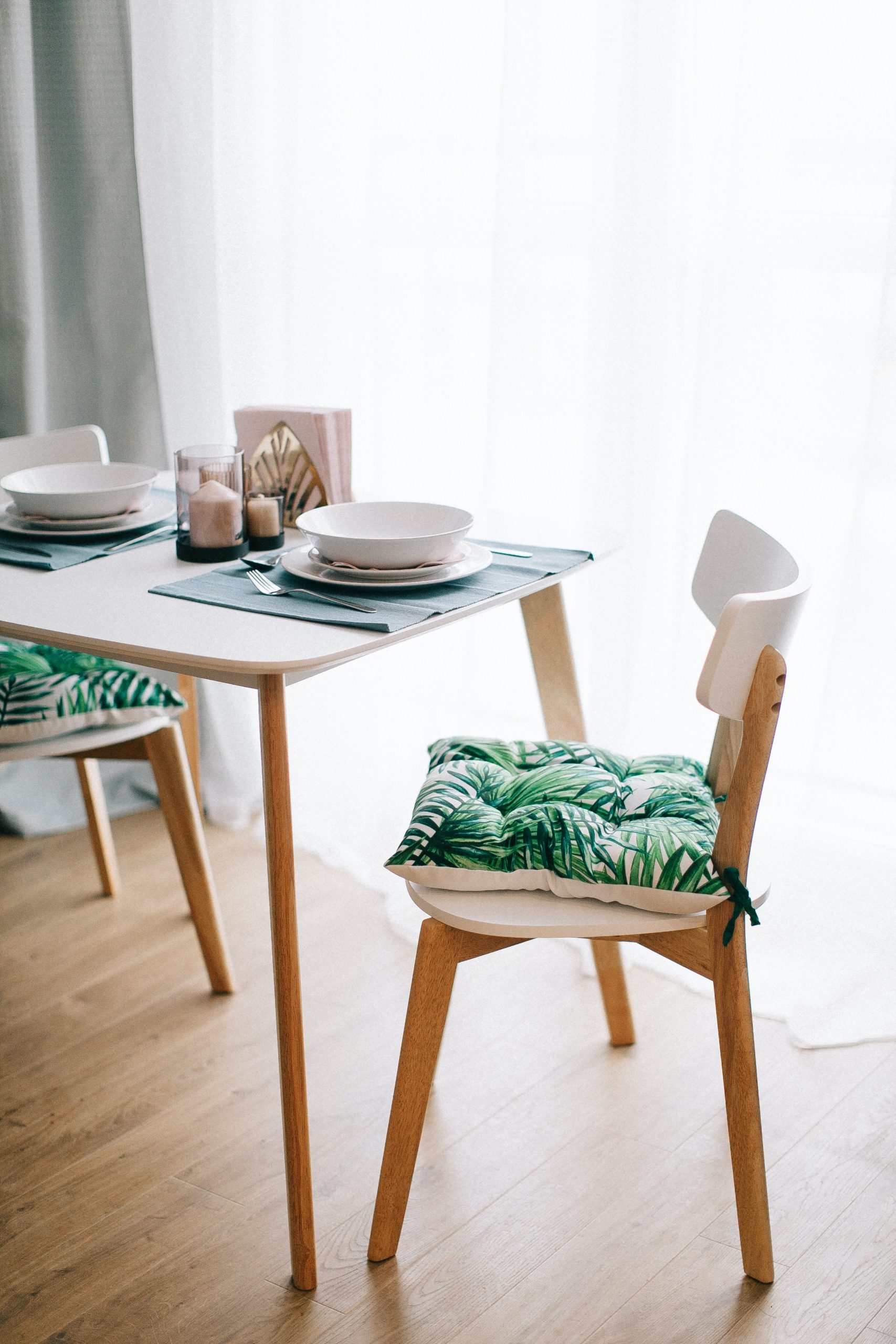
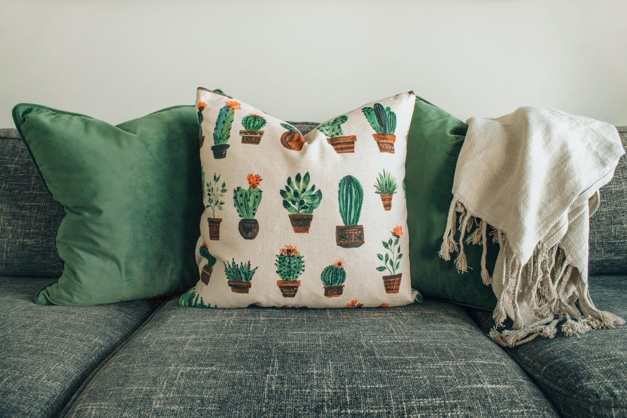
Both images have green as nature patterns on the cushions. There is feeling of depth, and sinking down, as if you are outdoors in the garden. We design a lot of our houses to bring the outside in with large glass opening doors. The same can be done using soft furnishings.
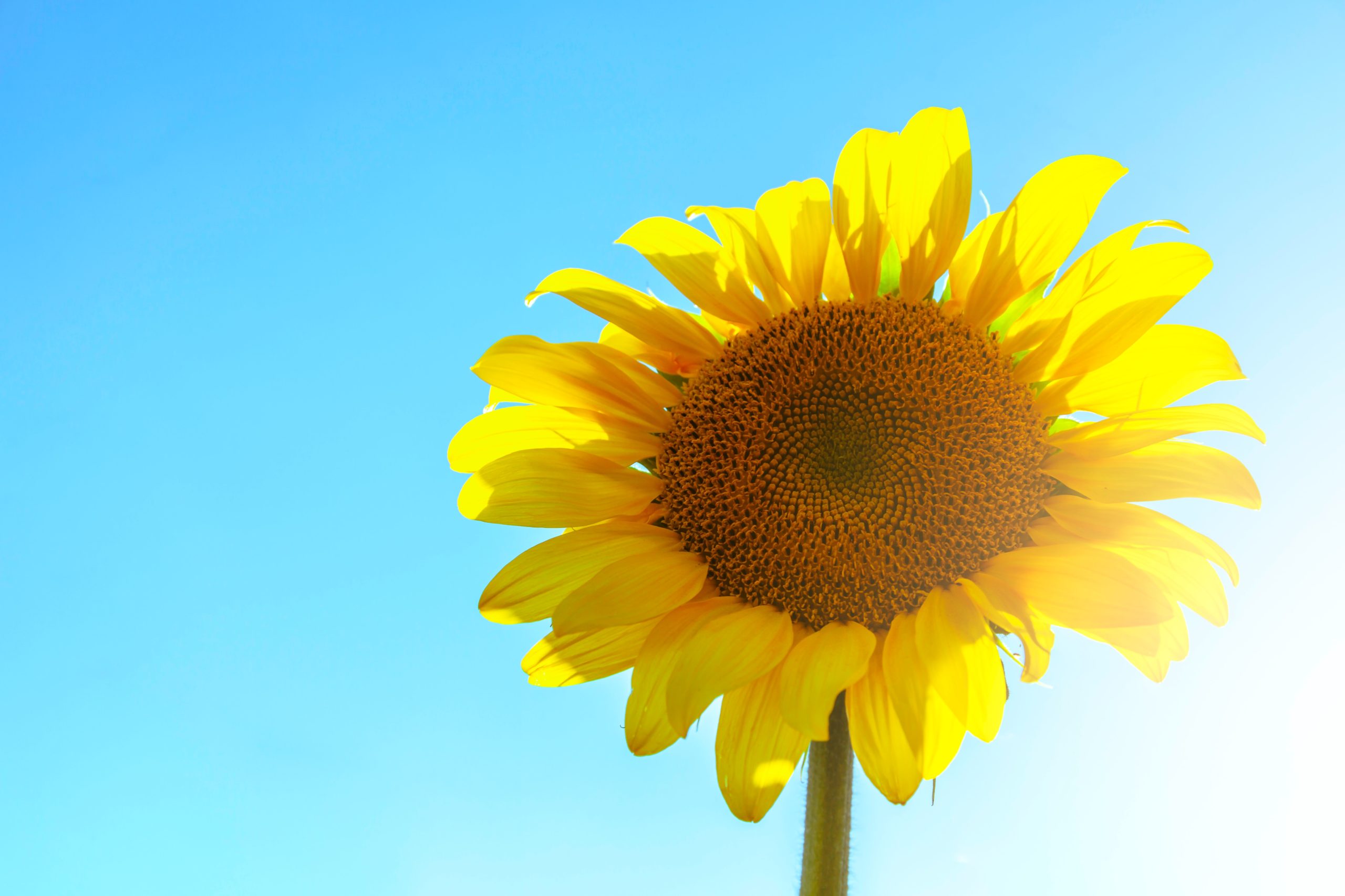
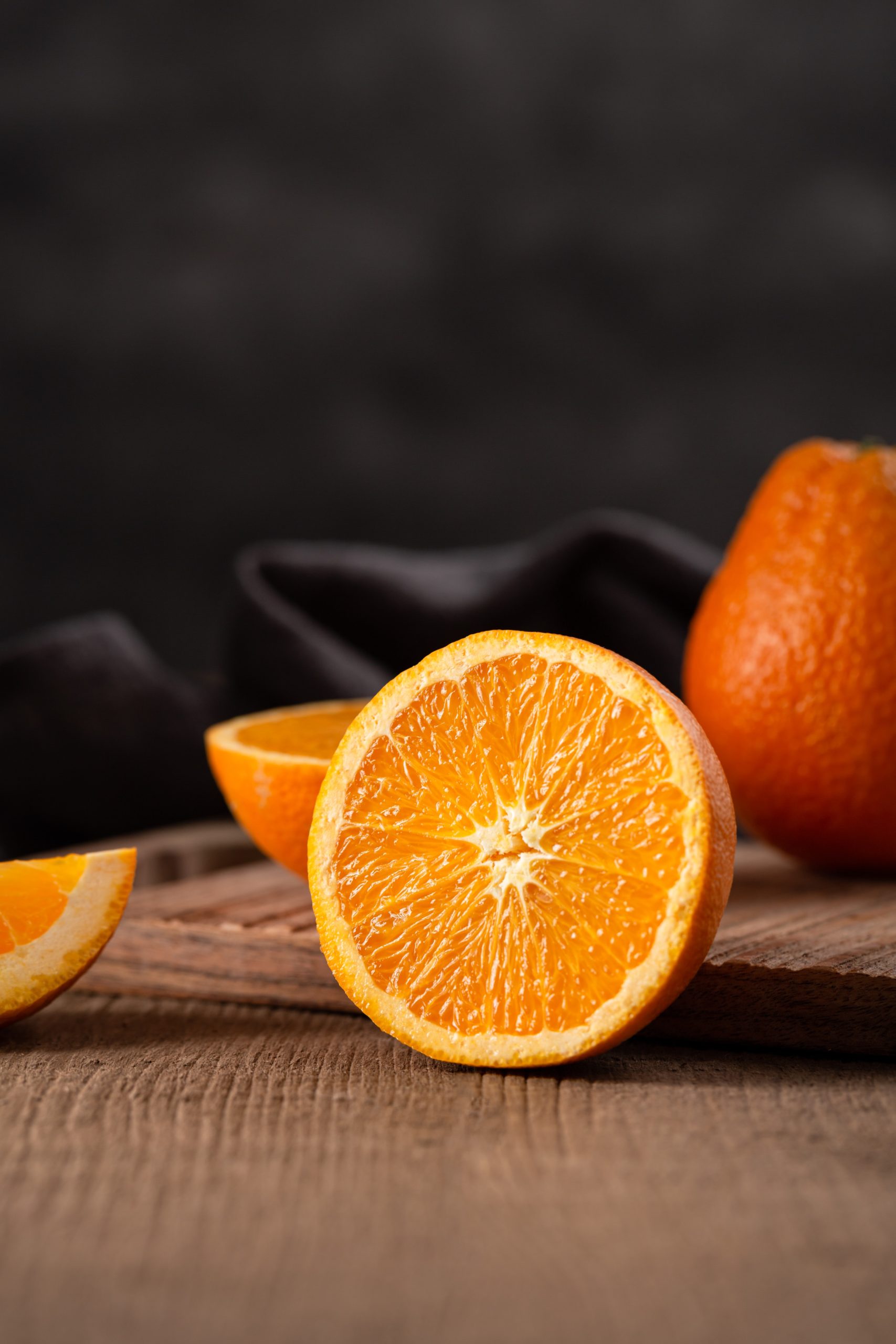
By comparison, let’s look at yellow and orange. Both are warm colours. Yellow is a really optimistic colour, full of laughter and brightness like sun after a storm. Orange is warm and friendly, cosy.
If you have a small room, often cooler colours can give the illusion and feeling of the room being bigger. If you have a really big room, and you want to create a cozy spot, add warm colours like yellow or orange. The warmer create the illusion of bringing things closer.
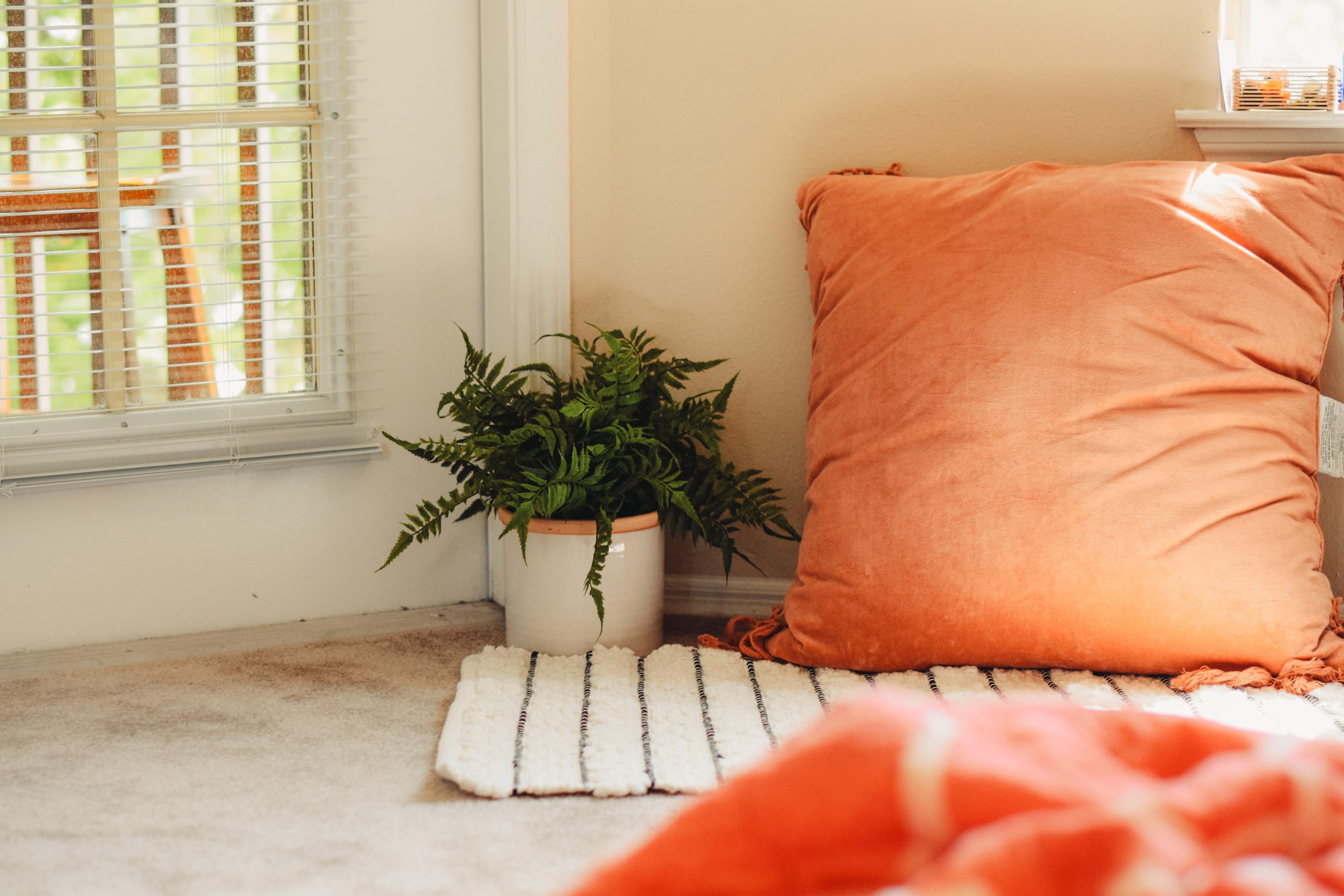
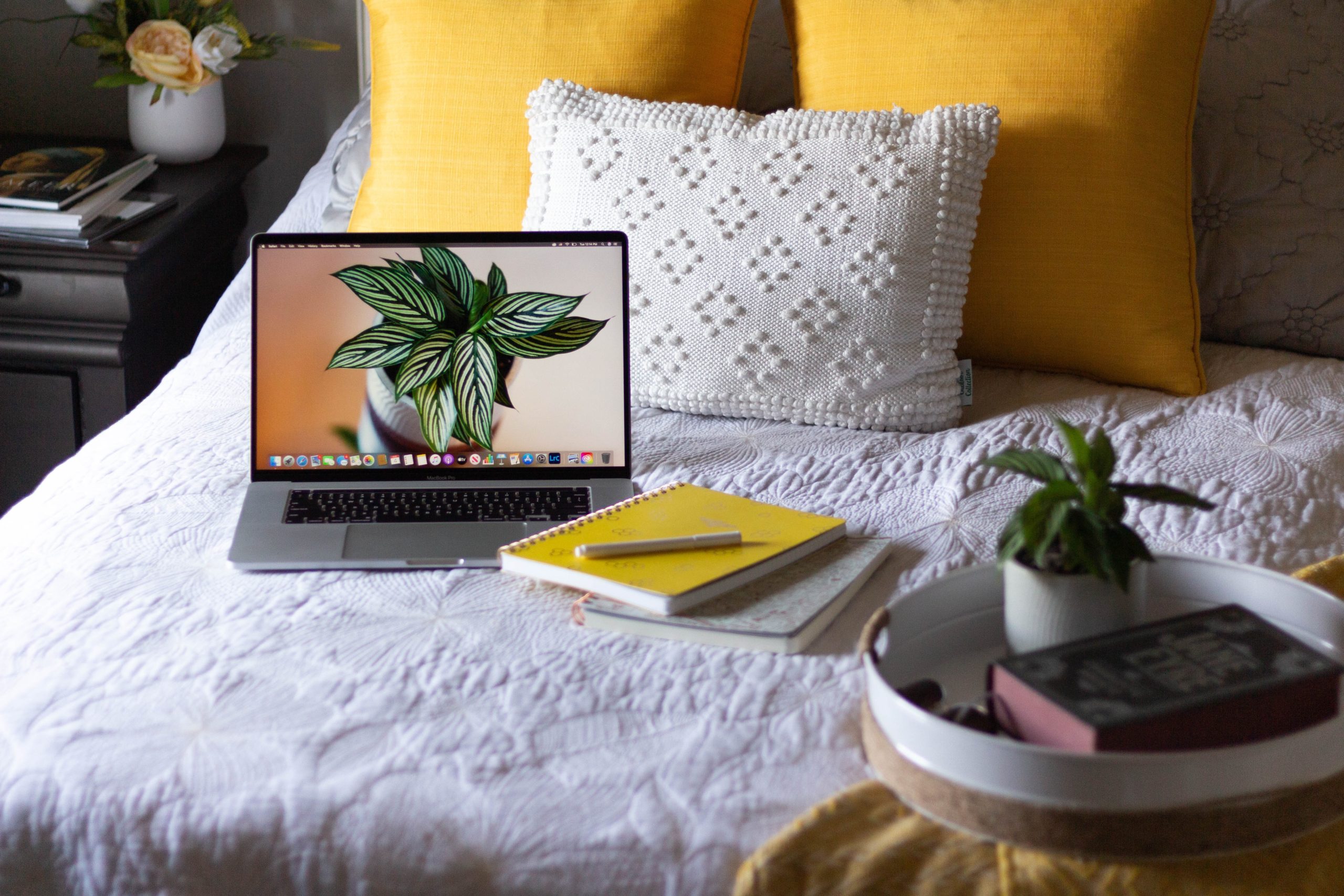
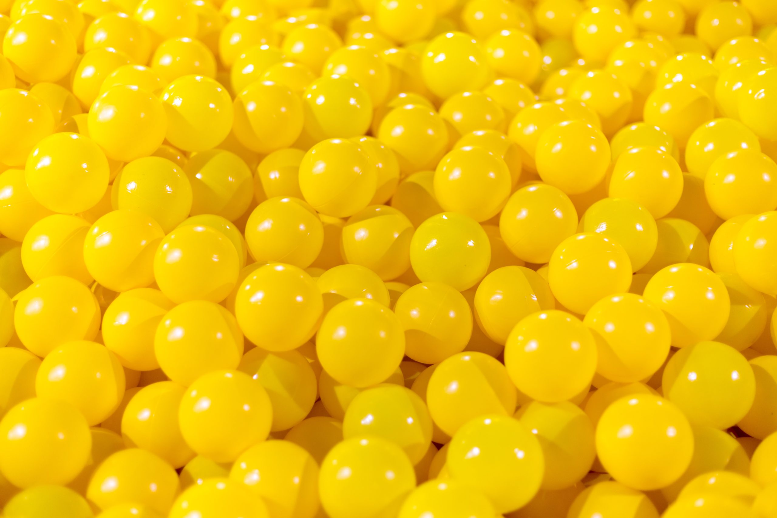
The orange cushion above creates an inviting space, perhaps for yoga or meditation. The yellow cushions on the right feel bright and happy, keeping your energy and vibrations high.
Why not try using warm and cool colours in small ways to feel the difference it makes in your home. You could try a vase, flowers, cushion, throw rug, wall art, wearing cool colours one day, and warm colours another. You are only limited by your imagination.
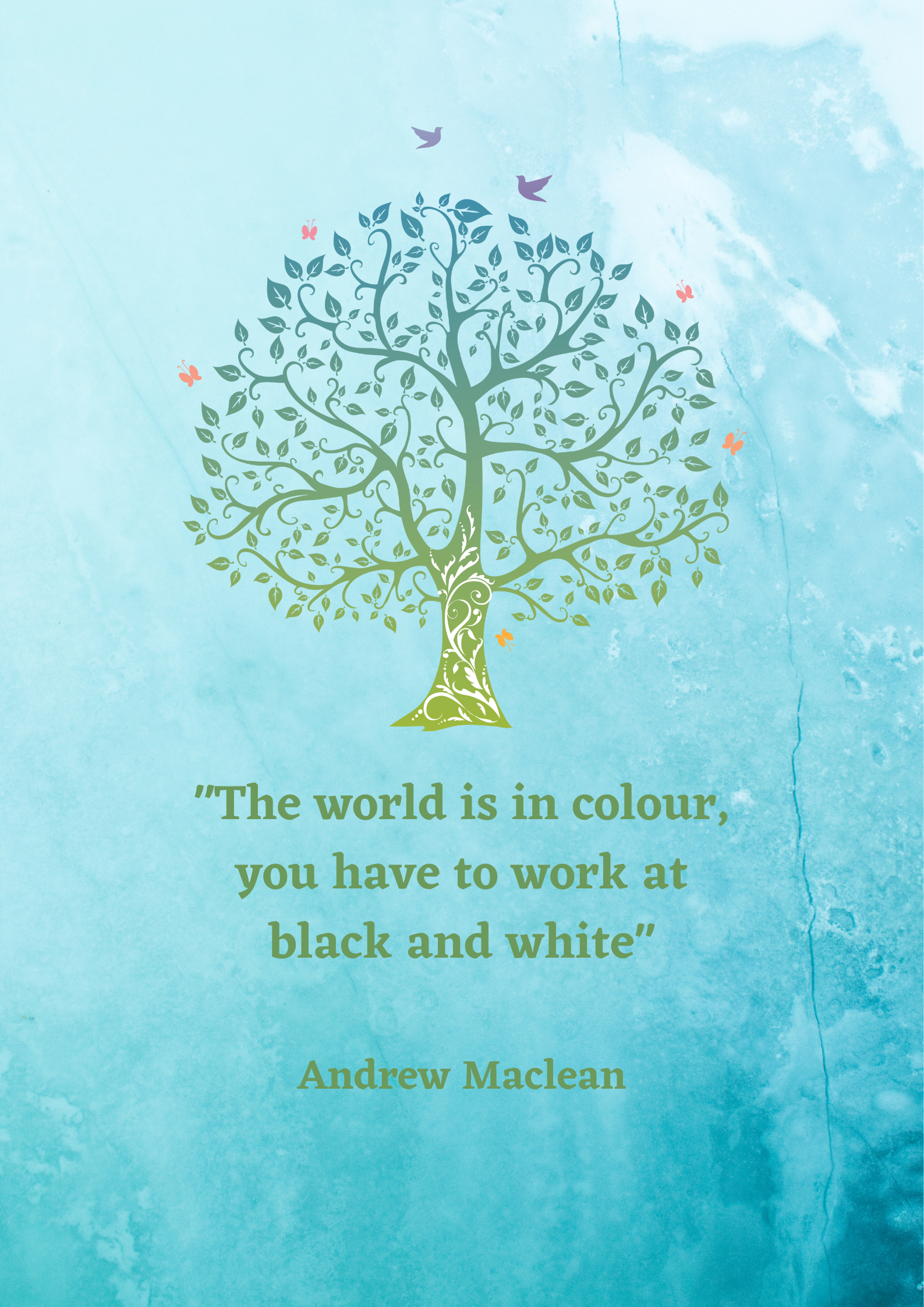
I love the quote below. We are surrounded by so many beautiful and glorious colours. Go for a walk outside – to the beach, to a forest or garden, near a cool stream, to the mountains. Stop, breath, and really take in how you feel. If we look towards nature in decorating, we can use the cool and warm colours as inspiration to create the feeling and vibration in your home and makes your feel amazing each day.